Sportsbet, one of the largest Australian’s online bookmaker, was looking for a solution to improve their current design documentation as the website was going through a complete reskin. I created a styleguide following Material Design guidelines to facilitate features’ development.
From setting the strategy to aligning business goals with user needs, I ensured a comprehensive approach.
In addition to this, I was the lead designer on the user’s account section where I had to define the different journeys it involves, from creating a new dashboard to define user’s priorities and most important actions.
The Bet History is one of them, so buckle up and let’s dive into it!
Hypothesis
I played a key role in identifying the problem areas and developing data-driven hypotheses to guide the design improvements.
By displaying the potential winnings and restructuring information, we improve clarity regarding fulfilment.
This reduces feelings of missing out on potential bets, meaning lower exit rate. Ultimately, the app’s lifetime value will increase.
Information Redesign
Since I was assigned to an ongoing project, I joined at a later stage (V2). My first instinct was to learn more about the history of this section (V1) and identify all changes made.
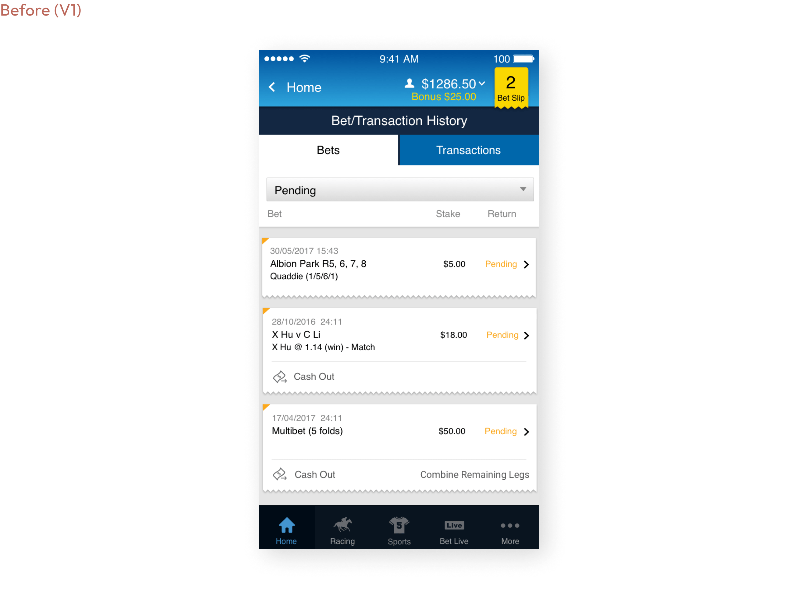
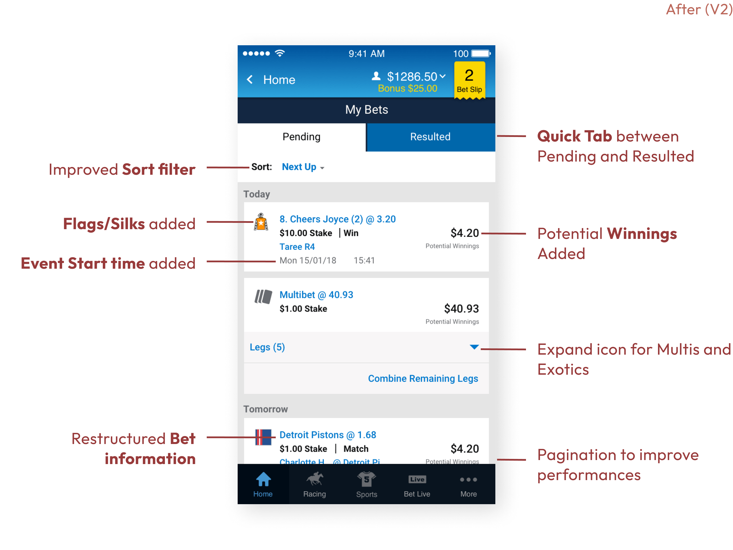
In order to develop further my learnings, I consulted user feedback resources.
"Why can u no longer see the point total or handicap lines in a placed multi bet?"
Will, 43M, experienced punter.
"I wish I could share a promising bet to my friends, so they can also benefit from the potential wins"
Geordie, 28M, amateur punter.
Surveys
"How does the new Bets section compare with the previous version?"
Much Better
Moderately Better
About the Same
"Overall how easy is the updated Pending and Resulted bets page to use?"
Extremely Easy
Somewhat Easy
Neither Easy nor difficult
Me when a dev asks if I can update one line of css:
Competitor Analysis
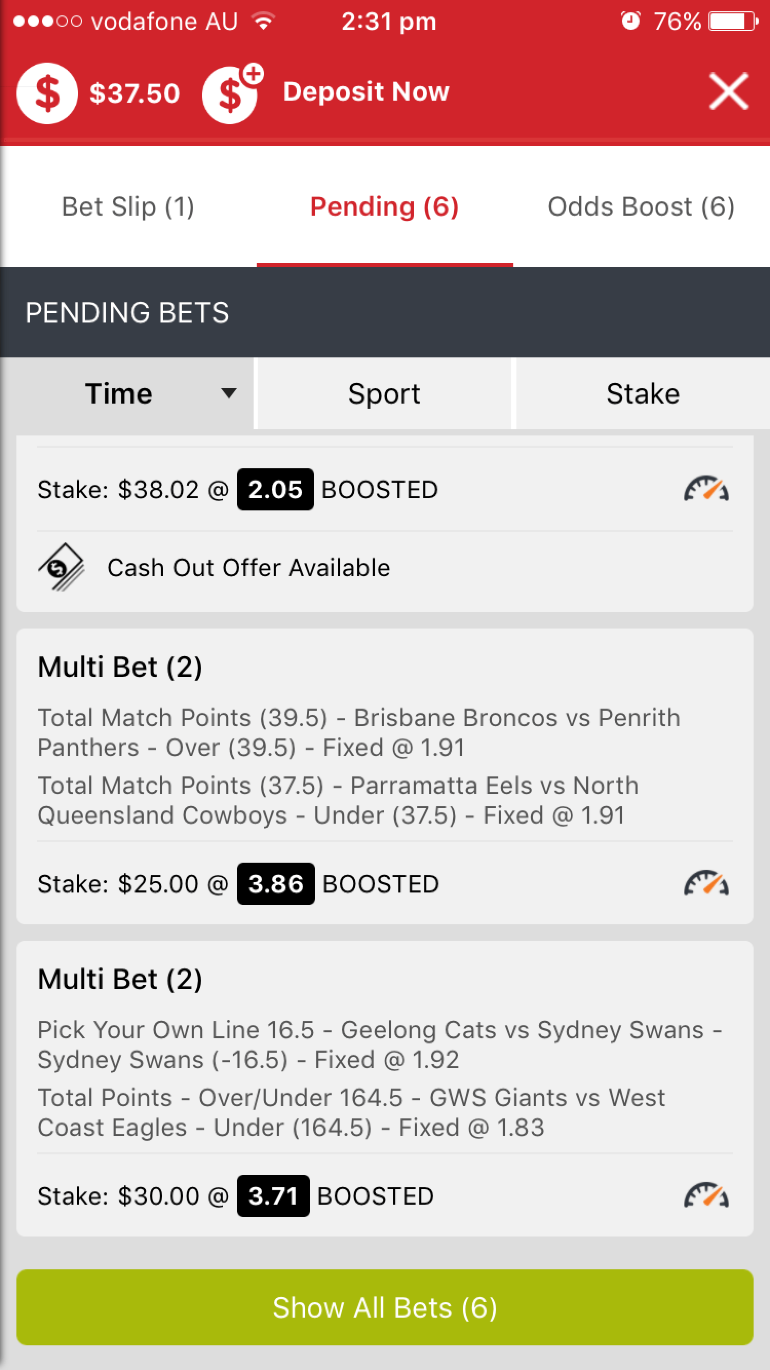
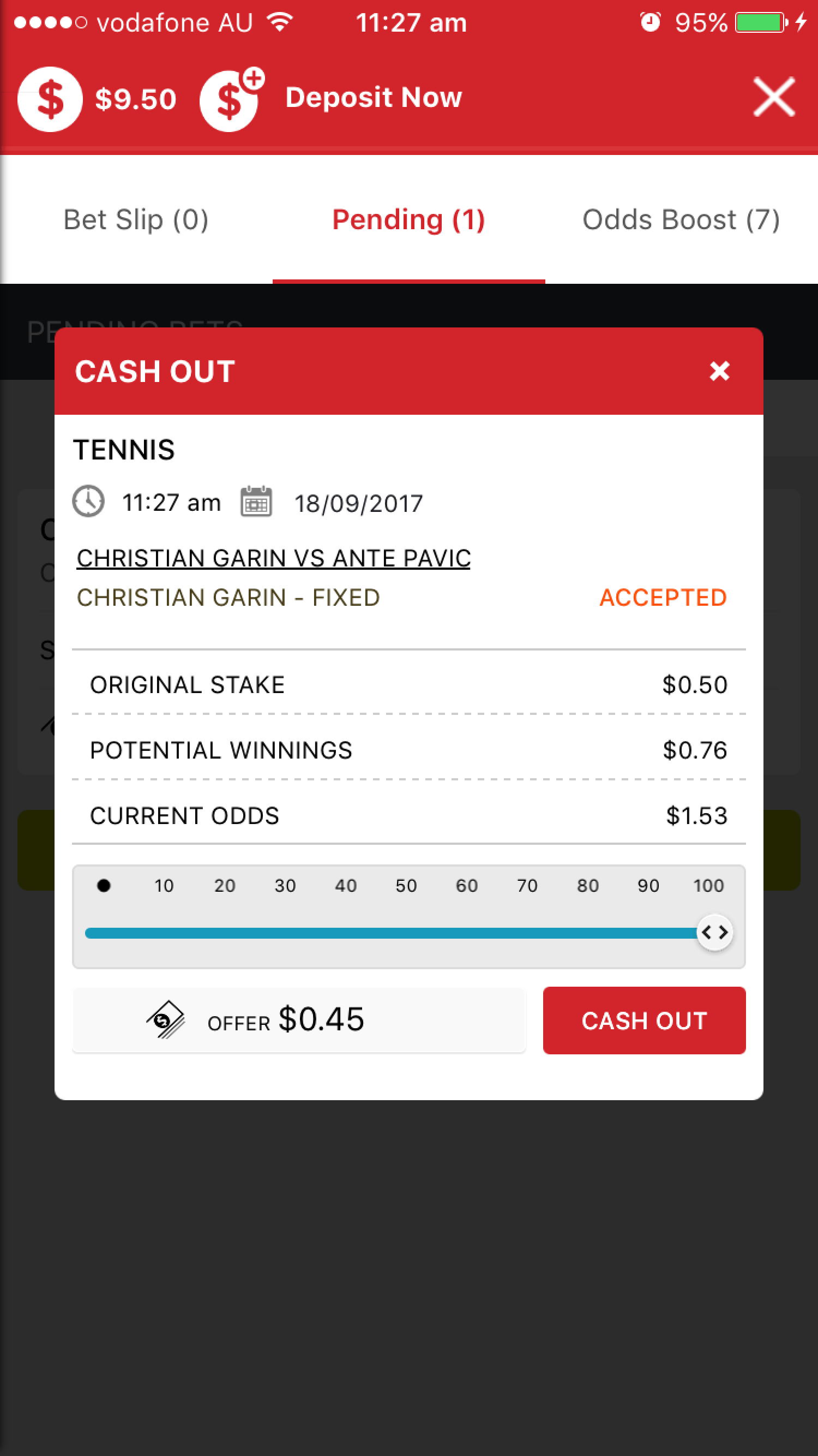
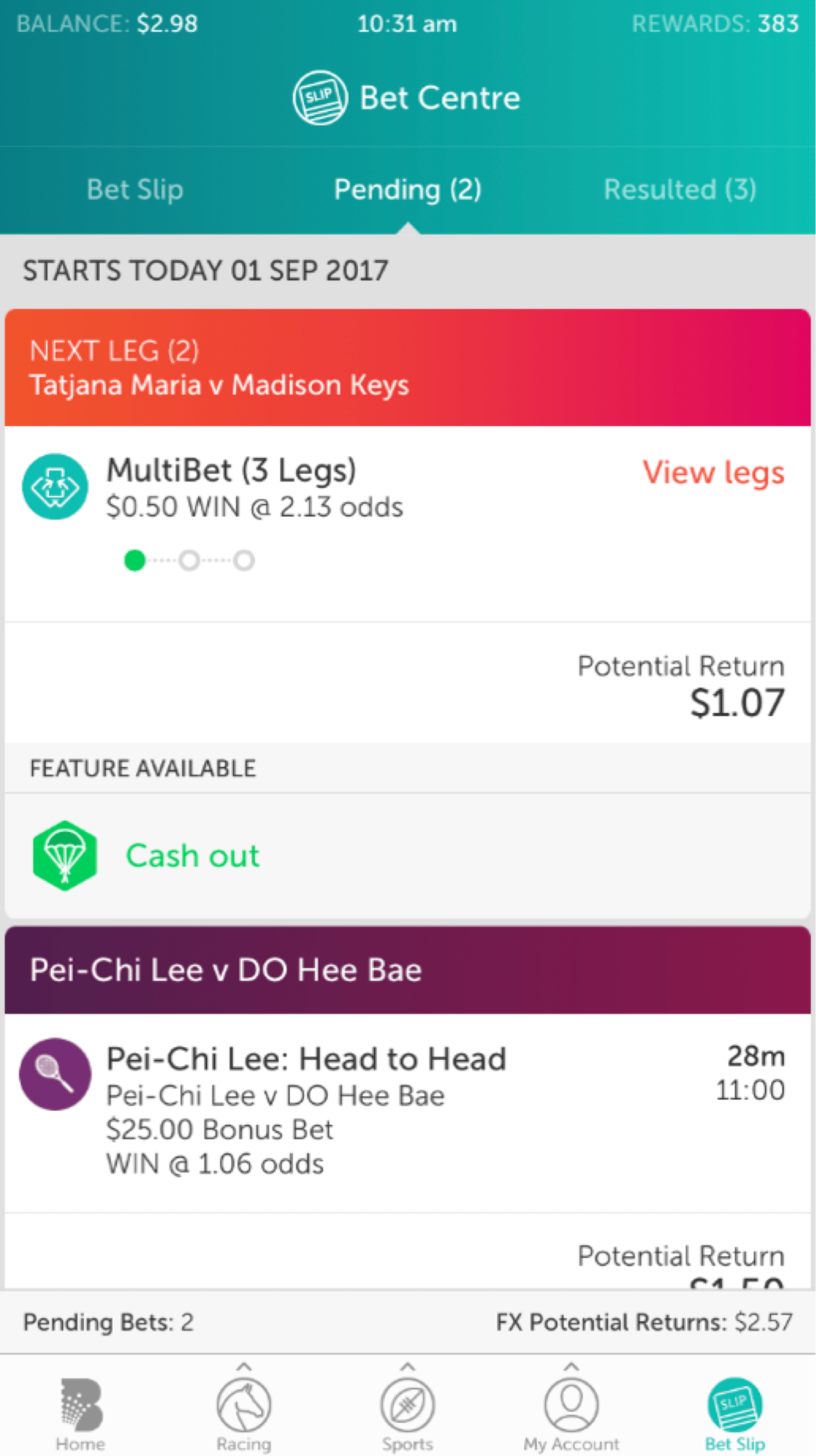
To understand how a punter sets odds, accepts and places bets, I analysed the betting model of most commonly used bookmaking apps in Australia.
What I learned:
- Most apps have a Sort functionality but no Filter
- Simple detail view of a pending bet, but missing core information (i.e. event start time)
- Cash out flow always populates a new screen with additional steps
- Navigation is quite restricted
Understand bet-ter the Punters
Facilitate low effort choices throughout the journey
Make choices easier to reduce cognitive load: prominently display the potential winnings so customers don’t have to do maths.
Apply incentives to steer behaviour
Be specific towards visitors about what they could gain: focus on maximizing gain, which will seemingly increases conversions.
Stuck customers are open to relevant guidance
Provide multiple ways to help users find the bet they need.
Friction (negatively) impacts behaviour
By implementing a re-bet option it enables visitors to place multi's which reduces friction.
Ideation
Throughout this project, I focused on initiatives that would improve efficiency and create a more coherent user experience. I led the ideation process, working closely with the Engineering team to develop continuous feedback loops.
Additionally, I conducted weekly design reviews with the Experience Design team, ensuring that insights were quickly integrated into the design and development process.
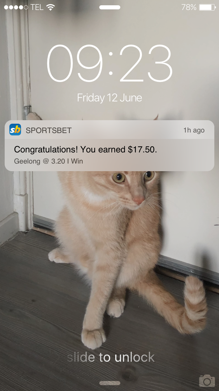
Giving customers the ability to set notifications for resulted bets
Insights taught me that +100,000 users enable reminders in their settings. Customers will use ‘Race/Event Reminder’ more if it is a function to select in Pending Bets, which as a result will increase engagement.
This is also an opportunity to get customers back into the app to integrate with Share a bet (see next section).
Share a bet
I discovered that the number of bets shared by 20% of active android customers since May 2017 is 163,036, with an average of 5 bets placed per user. If we extrapolate the ‘20% of Actives’ to the iOS active base, this equated to 127k customers.
By adding to bet slip a functionality (link for email and SMS) to make it easy for receipts to add the shared bet to their betslip, we can drive reactivates and turnover considerably.
Integrating a quick link to watch live streams and race replays
Approximately 65% of customers who streamed horse racing events placed a bet within the same session.
Making streaming/replay navigation easier and quicker will increase overall usage of streams and add a new level of excitement for users.
UI Treatment To reduce Cognitive load
When going through screen recordings and previous user test results, I spotted UI improvements the section needed:
- Add label to “Potential Winnings” for clarity
- Improve icons styles and placement
- Enhance colour coded states
I ensured design consistency across all touchpoints and led post-launch iterations to further enhance the user experience.
Project Learnings
Adapting to local customs
From my experience living in Australia, people don’t confront as much as other countries I’ve been used working in. As a result, some valuable feedback would be delivered later and impact the whole scope.
Usability: conducting equal sessions is essential for fair results
During a user test, I suggested applying design changes on the go/in between sessions based on previous comments. While it sounded good at first, I didn't consider it would negatively affect results. As a result, these quick updates would not be able to provide an equal experience for participants, resulting in nuanced feedback.
I also conducted various workshops to improve the team’s design workflow by creating useful Sketch libraries with powerful symbols. The outcome was very positive as we enabled advanced and junior designers to quickly create high-end mock-ups in a faster way, but more importantly ensure consistency across all departments.
As I was the styleguide gatekeeper, I was the point of contact for any request designers or stakeholders would have. Being the go-to person is something I like to embrace, as it shows the trust a team/manager can put on me.


