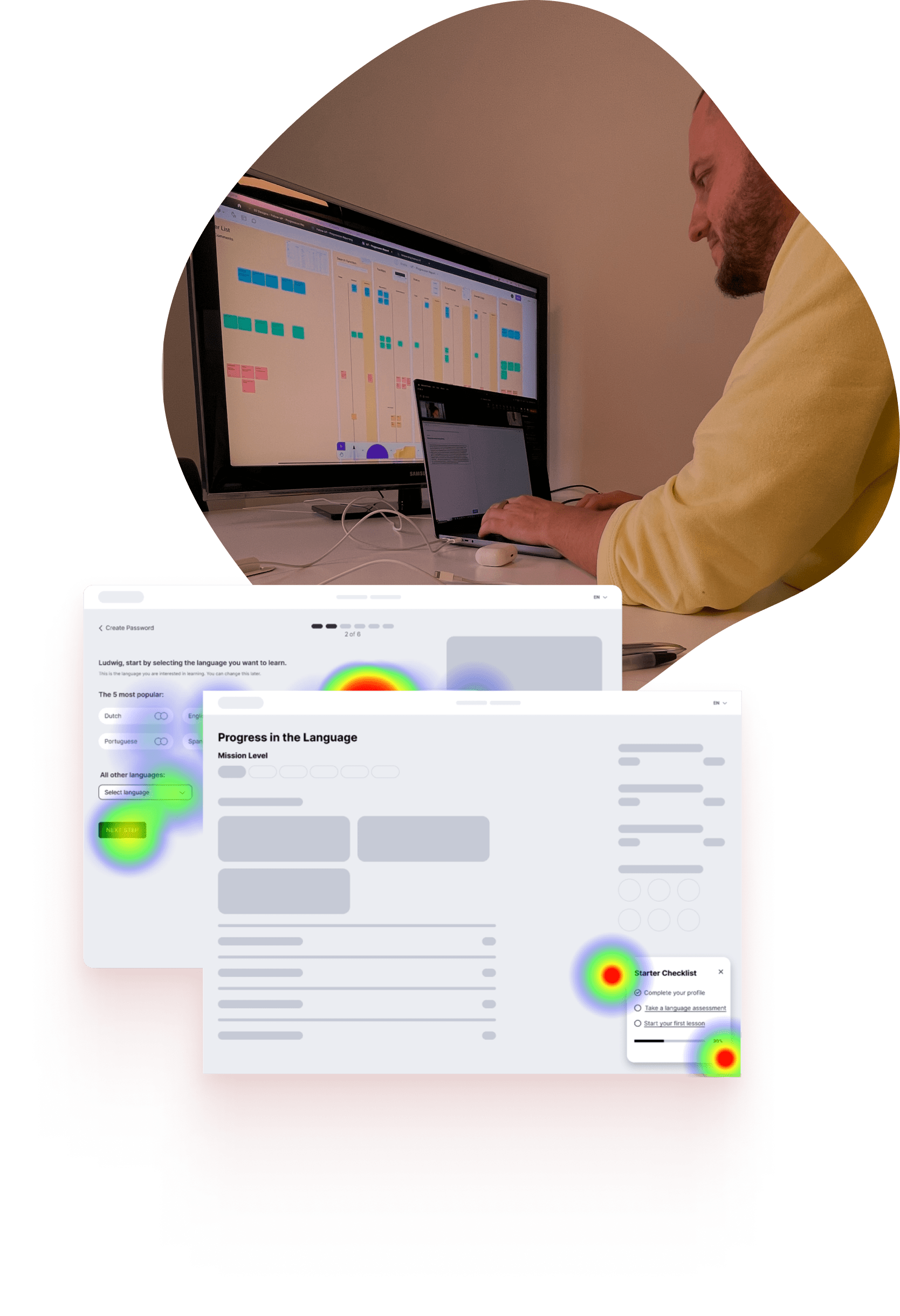
Altissia, a language learning platform, needed to improve its onboarding process to make it smoother and more engaging for new users. My goal was to help increase user engagement and understanding by creating a personalized experience with clear communication.
The ultimate aim was to boost long-term user retention and satisfaction.
From defining the project strategy to aligning business goals with user needs, my role ensured a cohesive vision from start to finish.
Objective
Revamp Altissia's onboarding to offer new users a seamless and engaging onboarding.
Goal
Enhance user engagement by delivering personalised experiences.
Impact
Increase long-term user retention and satisfaction.
The Challenge
The existing onboarding process at Altissia lacked the personalization and clarity needed to keep users engaged.
This led to many users dropping off early and not fully engaging with the platform.
My job?
Design an onboarding experience that would not only guide users effectively but also connect with their individual learning goals.
Design Process
If you’re reading this, you’ve probably heard of this process a hundred times—yes, it’s another Double 💎 approach! But hey, it’s popular for a reason.
I followed the classic four phases: Discover, Define, Develop, and Deliver. This method ensured every step of the redesign was guided by solid research, user feedback, and clear goals.
I actively managed stakeholder relationships, ensuring constant alignment and feedback integration throughout the project.
Discover
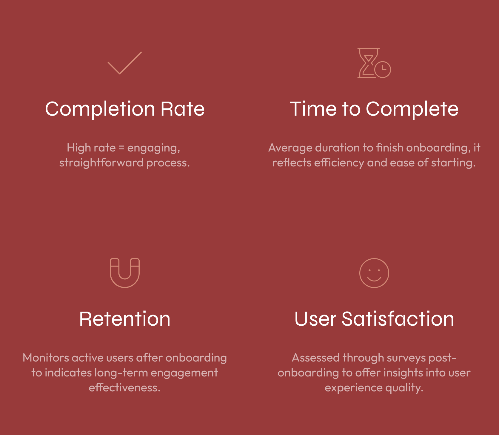
Tracking Key Metrics
During the discovery phase, I looked at key metrics like completion rates, time to complete onboarding, retention, and user satisfaction. These helped me understand how effective the current process was.
Aligning Needs
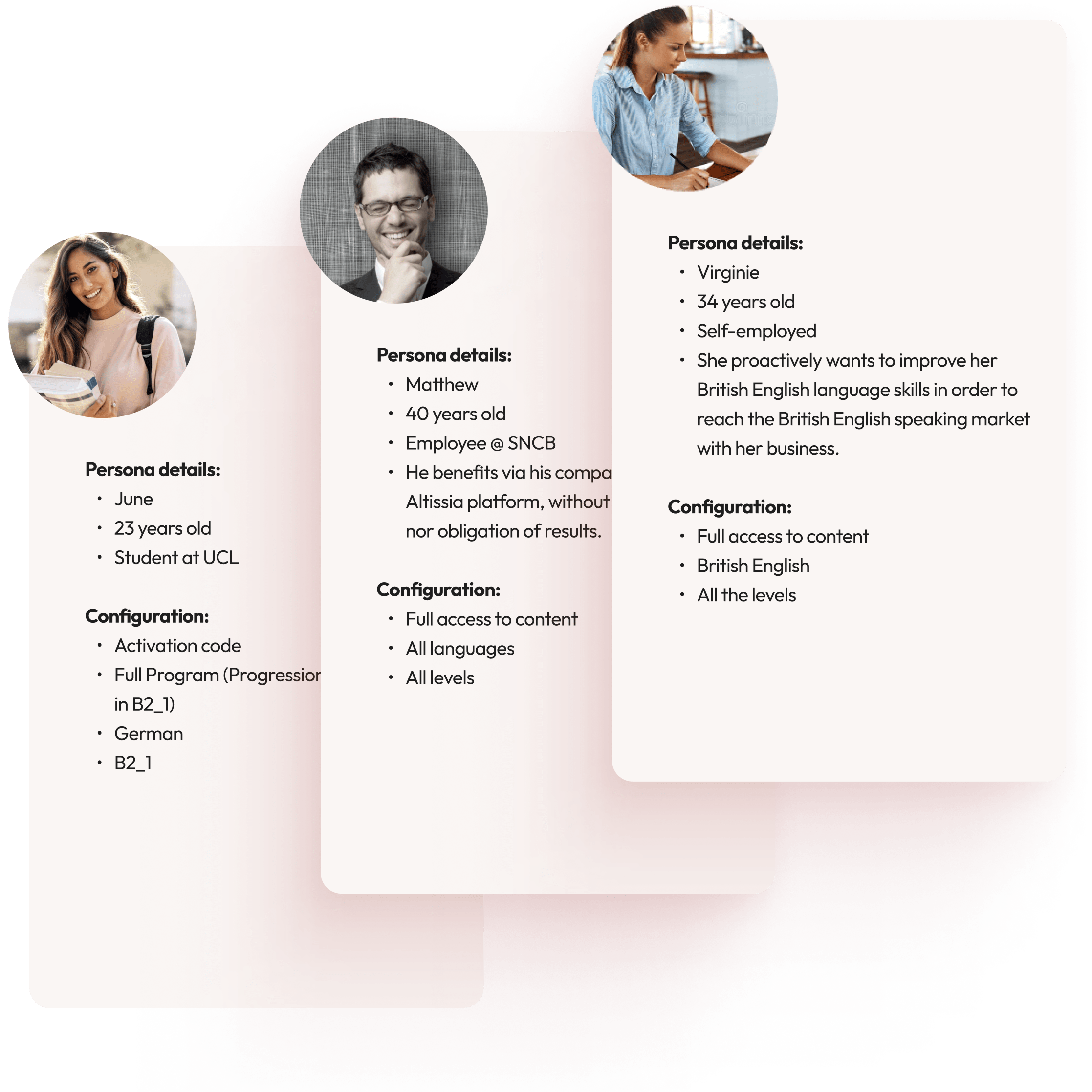
I've delved into understanding the essential needs of our users, engaging with business stakeholders and evaluating our onboarding process. This journey led to significant insights and actionable strategies to enhance user engagement and satisfaction.
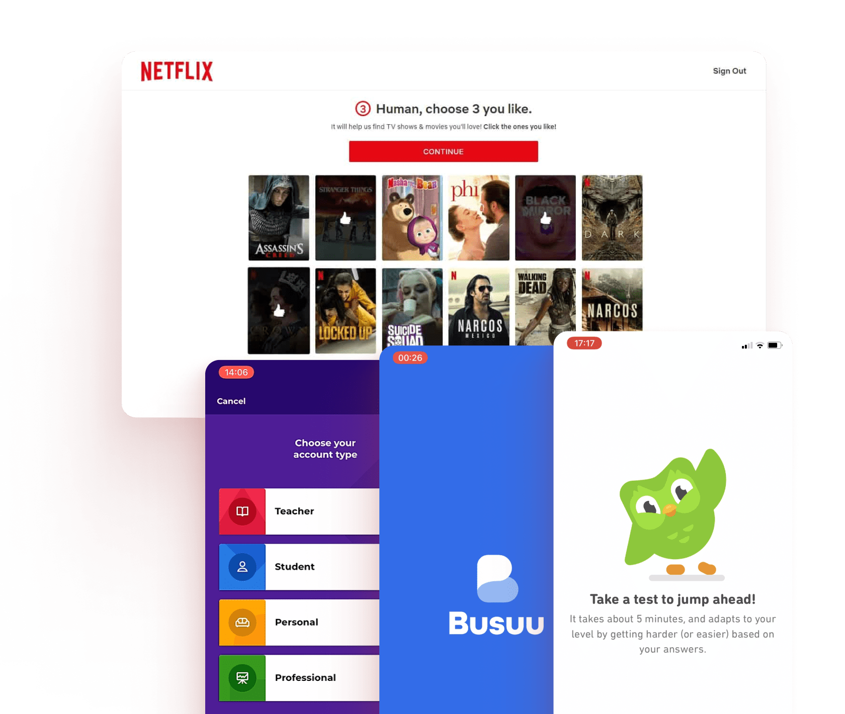
Benchmark Analysis
I conducted a thorough benchmark analysis focusing on industry trends, persona-based personalization, and conversational tones. This helped identify key opportunities to customize the onboarding experience for better engagement, create dialogue-like interactions, and align the process with user goals.
Strategic Actions
Personalization Enhancement
Focused on tailoring the onboarding process to individual user needs, ensuring each user feels the experience is relevant and engaging.
Process Streamlining
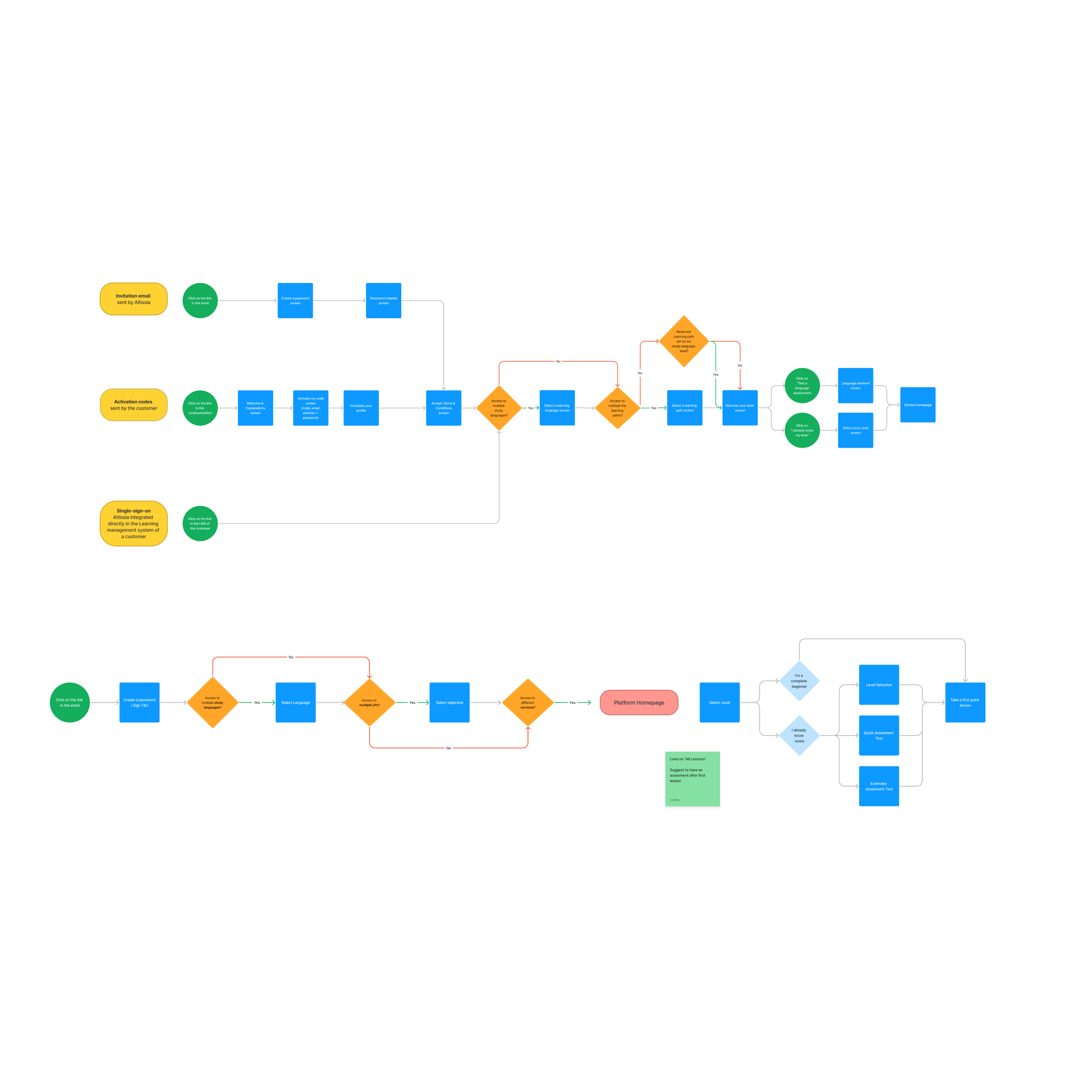
Simplified the onboarding steps to make the process quicker and more intuitive, reducing drop-offs and improving user flow.
Communication Improvement
Improved clarity and tone of messaging to better connect with users, making the onboarding experience more user-friendly and aligned with their goals.
Define
Develop
Generating Ideas
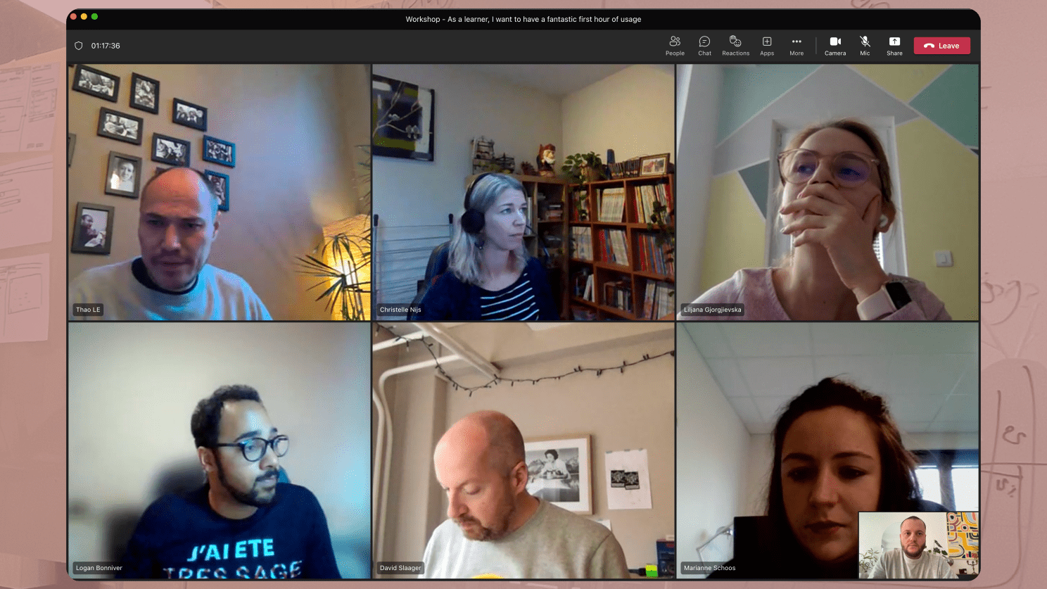
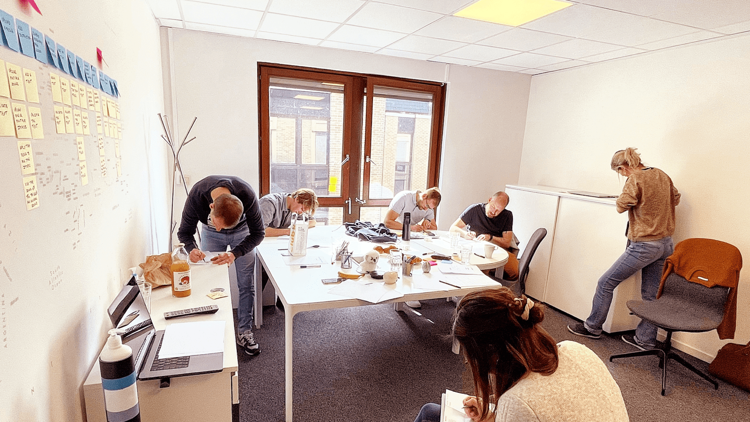
I led collaborative workshops with the team, including brainstorming sessions, design thinking activities, and sketching exercises. These sessions were all about harnessing our collective creativity to address real user needs, ensuring that everyone’s insights contributed to shaping the final solution.
Creating Wireframes
I focused on simplifying the user journey while incorporating early personalization to cater to individual user preferences. Additionally, I integrated dynamic elements to make the experience more interactive and engaging right from the start.
Usability Testing
I conducted a fully remote user test using Maze to quickly gather insights on how users interacted with the onboarding flow. This helped us refine the experience based on real user feedback.The results were clear:
• 85% of participants found the personalized learning paths more engaging than generic ones.
• Simplified sign-up process led to a 40% reduction in user drop-off rates during onboarding.
• 92% of users reported that clear progress indicators significantly improved their motivation.
• High praise for the intuitive design and personalized options.
• Suggestions for enhancing interactive elements to create a more engaging start.
High fidelity Prototype
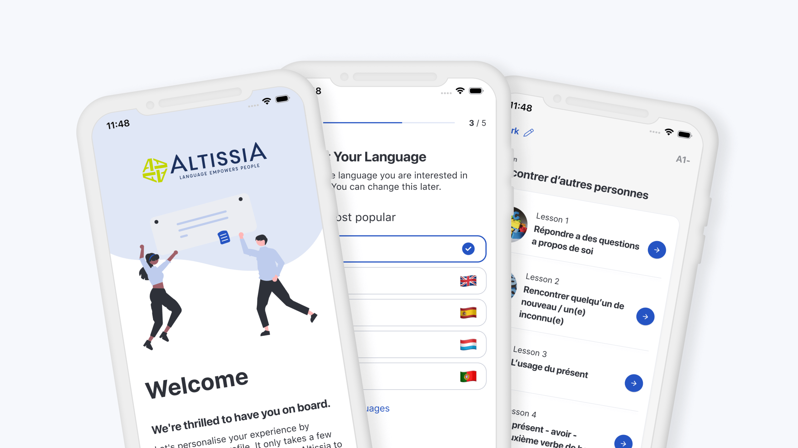
I developed high-fidelity prototypes for both Desktop and native App, they delivered effortless user journeys with smart personalization. These prototypes featured engaging visuals paired with intuitive navigation and were refined through multiple rounds of user testing to ensure a seamless onboarding experience.
For the mobile app, I developed a high-fidelity prototype that mirrored the desktop experience in terms of personalization and intuitive navigation. Special attention was given to mobile-specific interactions and visuals to ensure a seamless experience on smaller screens.
After multiple rounds of user testing, the app prototype was fine-tuned to provide an equally engaging and effortless onboarding process as the desktop version.
I created a high-fidelity prototype for the desktop experience, focusing on delivering smooth user journeys with smart personalization. The design featured engaging visuals and intuitive navigation, refined through several rounds of user testing.
This ensured that the desktop onboarding process was both visually appealing and easy to use.
Deliver
I meticulously prepared the handoff, creating detailed documentation to guarantee design fidelity during implementation.
Supporting Implementation
I collaborated closely with the development team to ensure the design was faithfully translated into the final product. This included providing detailed assets, guiding the integration of personalization features, and verifying that all visual and interactive elements were properly implemented.
Overseeing Deployment
While the development team managed the deployment, I remained involved to oversee the design’s execution. I reviewed the live product for consistency with the prototype, made last-minute design adjustments, and ensured the user experience was seamless across both desktop and app.
Evaluating Results
After launch, I tracked key design metrics, gathered user feedback, and assessed how the design influenced user engagement. These insights were essential for identifying improvements and iterating on the design to keep it aligned with user needs.
Key Takeaways
Prioritizing ongoing user feedback throughout the design process is crucial for delivering solutions that truly meet user needs.
Open communication and empathy between designers and developers are essential. They turn challenges into creative opportunities and ensure a smoother project execution
Regular testing and iteration are key to refining and enhancing the user experience, allowing the design to evolve based on real-world usage and feedback.
