Design System Quest
Client
Calvin Klein
Role
Senior UX/UI Design Lead
Year
2019-2022
Location
Amsterdam, The Netherlands
When I joined Calvin Klein as the only designer, the team didn’t have an actual Styleguide or Design System.
We depended on a brand book, which included the logo history (but not specifications) and typography, along with a master file in Sketch made by previous designers.
With my experience as a Design System Master in previous roles, I strategically transitioned from the brand book to a comprehensive design system, ensuring alignment with user needs and business goals while improving team workflow, developer handovers, and stakeholder management.
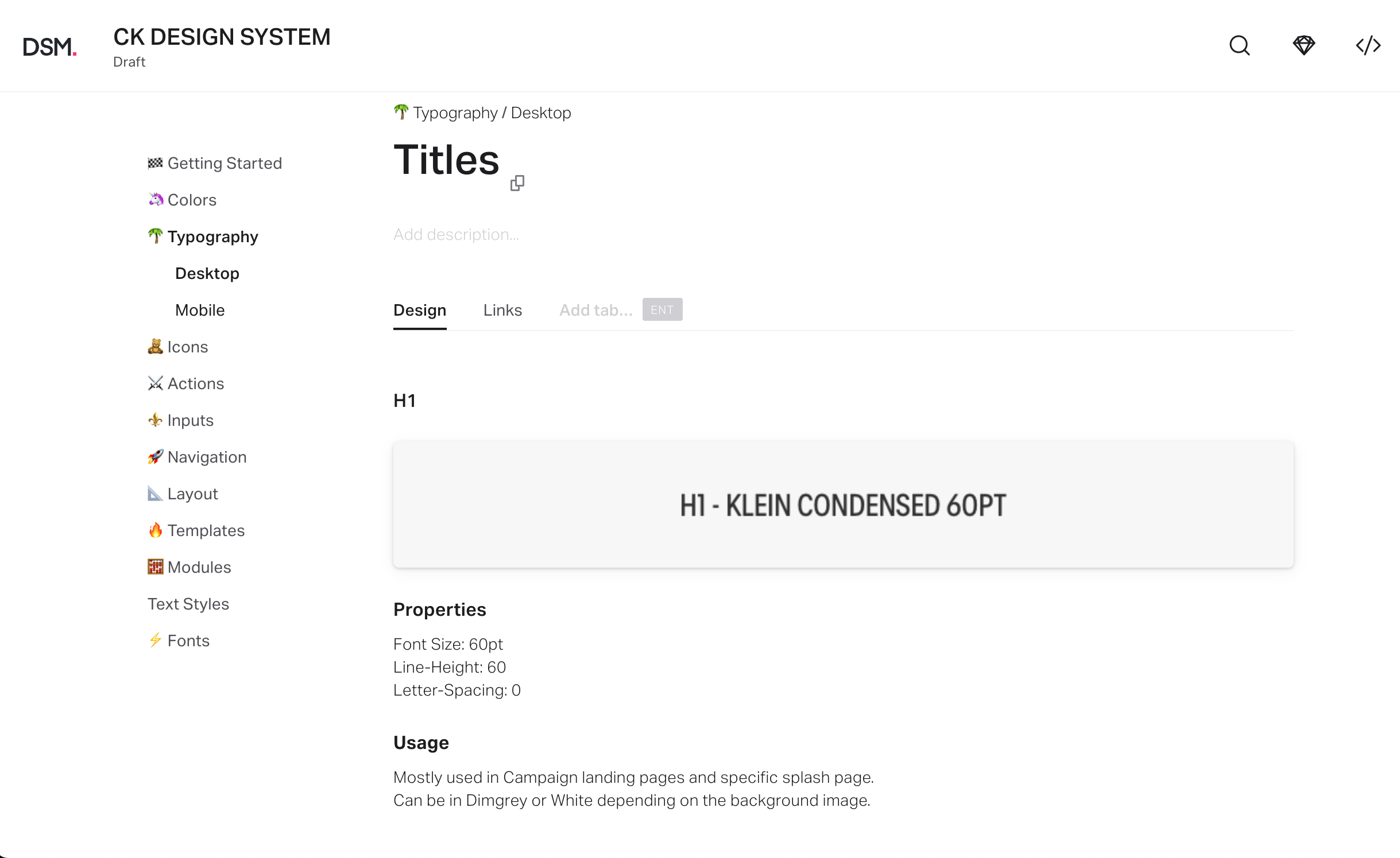
The sketch Master document
The UI Inventory
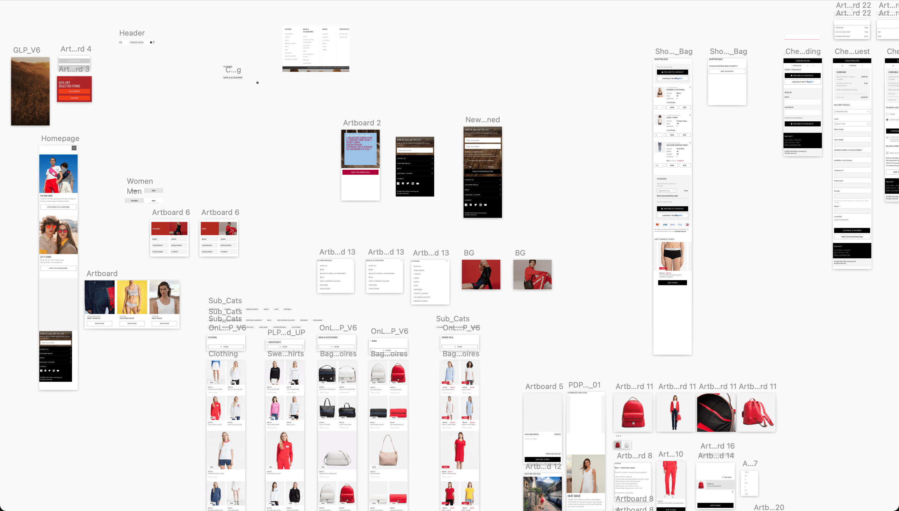
To better understand the current state of the existing design ecosystem, I started with a UI Inventory of the already existent components.
Based on Brad Frost’s interface inventory guidelines, I initiated my own content audit.
During this process, I captured unique examples of all design assets, such as typography, buttons, icons, and input forms.
By identifying inconsistencies, I uncovered opportunities to create a more systematic design approach that streamlined documentation, communication, and maintenance.
Updating the sketch file
As being the only designer in the team, I first built a sketch library which would include:
Modules
All individual components, built as Symbols to easily update the content


Templates
An abstract version representing selected pages with grids, framework, spacing.

As I was building this document, I took into consideration the scalability and sharing options for future projects. As part of our process, we would upload a final design on Invision where the development team had all the inspect options they needed.
The new version didn’t make a significant difference in the amount of time I spent answering questions from stakeholders or developers on a daily basis.
It felt necessary to rethink this workflow and luckily, Invision was just introducing their new feature: Design System Manager.
Invision's Design System
With the expansion of projects it became necessary to create a central hub to connect designers, developers, product, and marketing teams. Since Invision was one of our partners, I wanted to explore this direction and see how our sketch library could be translated into their Design System and how it will work with the external teams.
As part of my efforts, I created drafts of key pages and their content, which I shared with multiple teams as a means of gathering input.
Learnings
- Most developers found it useful but were still lacking technical information, which led them to go back to regular Invision pages. As a result, this became a first concern and raised my doubts about using this service.
- Stakeholders, such as product owners or marketers, were satisfied and could easily read the information and get what they needed.
- Maintaining it would require extra manual work to ensure it was constantly updated. Another negative point.
- In order to finalize the project and go live, we needed to apply for another licence. This was the final element which made me reconsider using this solution, so I decided to look into other alternatives.
Switching to Figma
With the growth of the design team, Sketch didn’t meet all the requirements when it came to collaborative work, so we decided to give a go on Figma. It didn’t take long until all designers felt comfortable to do the switch.
Being familiar with the tool, I also knew how well-known brands used it to build their own design systems, so this became an interesting direction to explore for this purpose.
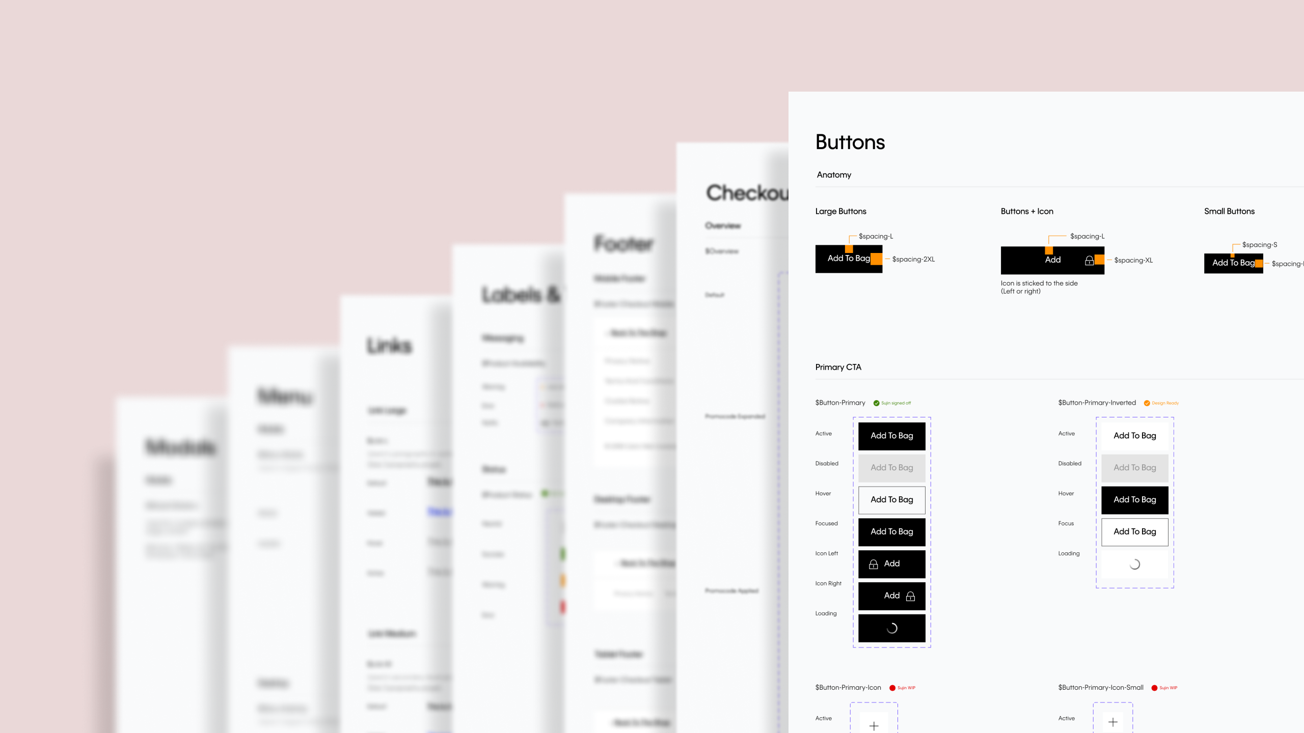
An example of the Button’s component page can be found below:
Creating a Design System in Figma
In July 2021, due to a company-wide reorganization, our design team at Calvin Klein merged with Tommy Hilfiger’s. In other words, while we were still working on individual brand-related items, we would have to work together on specific dual-brand projects.
Our goal was to unify pages between TH and CK, where excellent UX is primary, and brand experience is secondary. We started with Checkout and created a dual-brand design system to improve both designer’s and developer’s workflow & collaboration.
Structure per Brand
Components
A standalone UI element designed to be reusable across many projects
Process
As two UX teams merged into one, we decided to adopt an Atomic Design based approach and adapt our process accordingly.

Introducing Design Tokens
By giving an abstract name to a specific value, a token can work for both brands, making the unifying process effortless.
We found it much easier since designers and developers could finally talk the same language. As a result, there was less room for error, maintenance was manageable and scaling was much greater.
Dual brand component structure
Exporting the primary colour token for both brands
Tokenised components in context
Impact
I oversaw the implementation, monitored its impact, and iterated based on team feedback, ensuring long-term success.
We successfully implemented this approach during a checkout redesign effort, which MVP launched in January 2022.
This approach was very manageable and scalable, and all team members agreed on it’s keepability and scalability.
In this way, communication and collaboration between the development and design teams were improved.