The electric car company who needs no introduction was working on a EMEA-wide digital campaign for the launch of the affordable Model 3.
Life with Model 3 was a unique owner generated content experiment, inviting new owners across Europe to document and share experiences of their first month with Model 3.
I joined the lead agency for the project, The Brave New Now, to help them shape their vision and translate it into a coherent and engaging user journey.
Life with Model 3
50 Owners across Europe (including Influencer Owners) were selected to be part of ‘Life with Model 3’. Each Owner was sent a GoPro, mount and content brief outlining what they would have to capture.
The footage collected would be edited to create a series of authentic, engaging films that focus on all aspects of ownership and show the true benefits of ‘Life with Model 3’.
The intention: Model 3 is a car for everyone.
All hero content would be constantly updated and featured on the site, as well as funny, ‘human’ highlight clips seeded out on social. From a dedicated landing page, audiences could learn about the project, Model 3 and sign up to take part themselves.
And this is where I came in:
As part of the project, I created the landing page that would be a continuous flow of curated content, showing the breadth of Owners and their Life with Model 3. A clear CTA would encourage lead capture and sign up.
Now let’s rewind a little and start from the beginning.
Research
Understand Target Audience
Defining who I was designing for helped me understand how to define the flow and its level of complexity.
Stick to the Styleguide
As the flow would live on Tesla's site, aligning with their styleguide was essential to maintain consistency and ease implementation.
Make it Mobile Friendly
While the focus was to design for desktop, the emergence of mobile use expressed the need to align the experience for this resolution.
User Flow
Working in an agile environment allowed me to follow the design thinking methodology:
Sketching
I started by sketching all the different parts of the flow to get a visual idea of the directions to take.
Landing
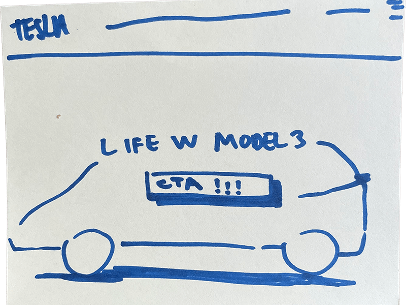
To create an engaging call and to stay inline with the product detail pages, I thought of displaying a video or pictures of the model 3 in action, in combination with info about Life With Model 3 and a clear CTA to start the flow.
Grid
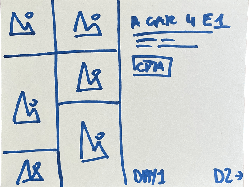
My first thought was to anticipate a layout that would enable a large amount of daily/weekly updated content to be displayed in an organic way. It quickly came to mind that the most suitable option would be a grid layout.
Form
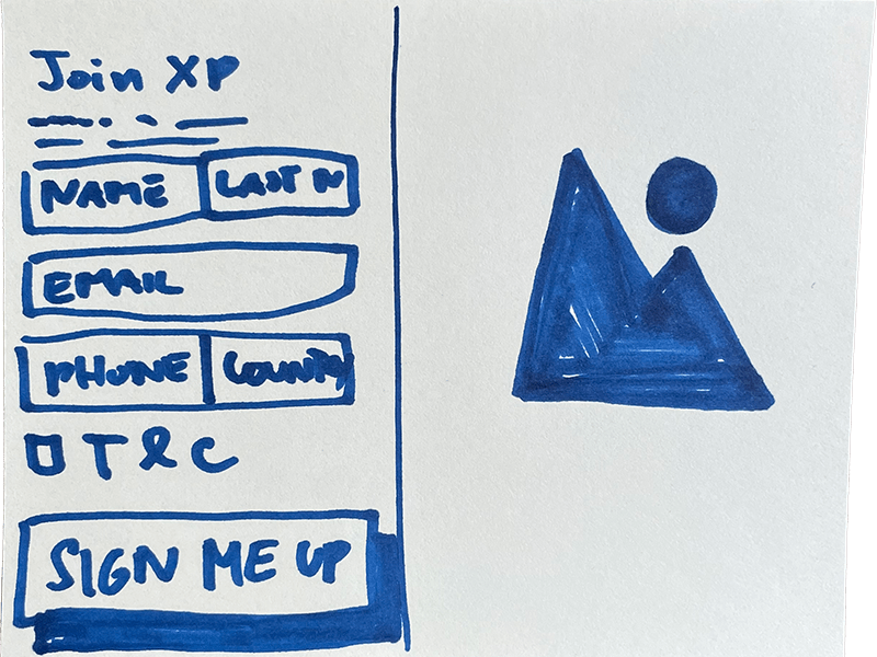
The third part would be the form, initially conceptualized in a compact way, would display all relevant fields and additional content to make it richer.
A “Thank You” message would be displayed and the option to continue browsing the site through a CTA.
After this, I could already share a first draft of wireframes.
Taking it to the team for a first round of feedback helped me understand what part to improve.
Some key inputs were:
- This landing page was too focused on the owners and is missing some branding and attractive elements of the Model3.
- As a result, it was more of a content page than a campaign one and was lacking a sense of exclusivity.
- The explore filters were a good idea, but it was necessary to determine if they were technically feasible.
I took these with me and came back with a refined version
This version went through a few minor tweaks, but was solid enough to present to the client and gather feedback.
The concept came back positive, so I could refine some elements based on the client’s input.
Rethinking my approach
The limited time and resources prevented us from making this even better. In spite of the fact that my assignment ended before the Go Live, I wish we had the chance to push it even further, so here are some things I would have done differently:
