
From setting the project strategy to aligning business goals with user needs, I ensured a cohesive and results-driven approach.
As the Lead UX/UI Designer for Calvin Klein Europe’s e-commerce platform, I oversaw the design across 27 countries and in 8 languages. Initially brought on board to elevate the customer experience, my role quickly expanded as I took charge of a design team, orchestrating a comprehensive and user-centric online journey.
I present to you now, a checkout journey that I believe supports my work process and solution focused attention to detail. I have a plethora of campaigns, new features and AB tests experiments that I would love to have included additional.
If you would like to know more about them, please get in touch.
Solution
Customer Retention + Frequency.
The way to achieve growth is to focus on retaining our existing customers, increasing the frequency of their visits as well as their AOV.
How to get there:
Mobile First
I adopted a Mobile First strategy in response to the shift towards mobile usage, which accounted for over 60% of our traffic. I personally led the redesign of the checkout process, focusing on user-friendly practices and leveraging data-driven insights to enhance conversion rates.


End Conversion Optimisation (Checkout)
I revitalized the outdated checkout experience by implementing industry best practices focused on customer retention, aiming to increase visit frequency and average order value.


Research

Contentsquare
Through Contentsquare, I delved deeper into the customer journey analysis tool to discover:
- From the address page, 5% already goes directly back to the cart page
- 6% of all journeys from payment page go back to cart after seeing the payment page
- 12% go back to address page after seeing the payment page, of which then 44% goes back to payment again
- 14% leave the website after viewing the payment page
Competitor Analysis


I translated these insights into concrete design decisions, ensuring that every step of the checkout process addressed both user pain points and business objectives.
Survey
"Is there anything holding you back from placing your order?"
When visitors were shown to hesitate finishing their order, We ran a pop-up survey on the payment page in 6 countries. A selection of 300 responses were analysed.

From these results, I identify a quick fix to gain significant win:
“Can’t change expiry date of Credit Card”
By far the most common issue was measured to be with credit card input fields. Many users mentioned that they were presented with an error related to the expiry date dropdown.
I shared this finding with the appropriate team and suggested replacing the dropdown by a numerical input field, which is an industry standard component. The bug was fixed in a matter of days and went live within our 3 weeks sprint cycle.
We saw a significant improvement when running a follow-up survey (more details in the Outcome section).
Card Sorting
Through the findings as shown above, my team and I would regularly practice card sorting sessions to align the needed approach to prioritize the right actions. We listed all enhancements to bring based on survey results, but also backlog ideas and feature that needed to be tested.
Reduce Drop-out Rate In Checkout
1. Benchmarking study
2. Bugs in checkout process
3. Drop out location
Improve Customer Satisfaction
1. Post purchase surveys
2. Usabilla comments
3. Input from Customer Service
Optimize Ease Of Checkout Process
1. Form validation errors
2. Time in checkout
3. Recordings in checkout
Qualitative Research
The previous steps helped pin down the enhancements we needed to bring to the journey, now the next phase was to take this up to the concept level and create prototypes.
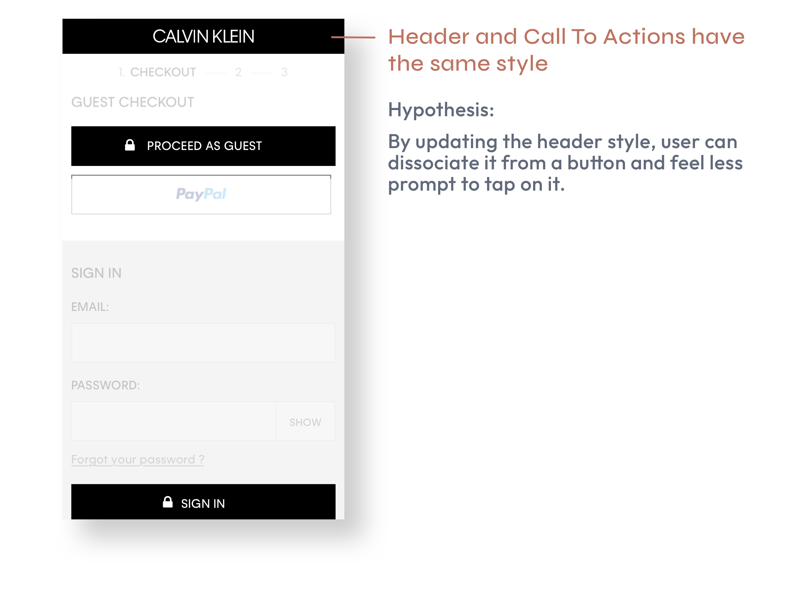
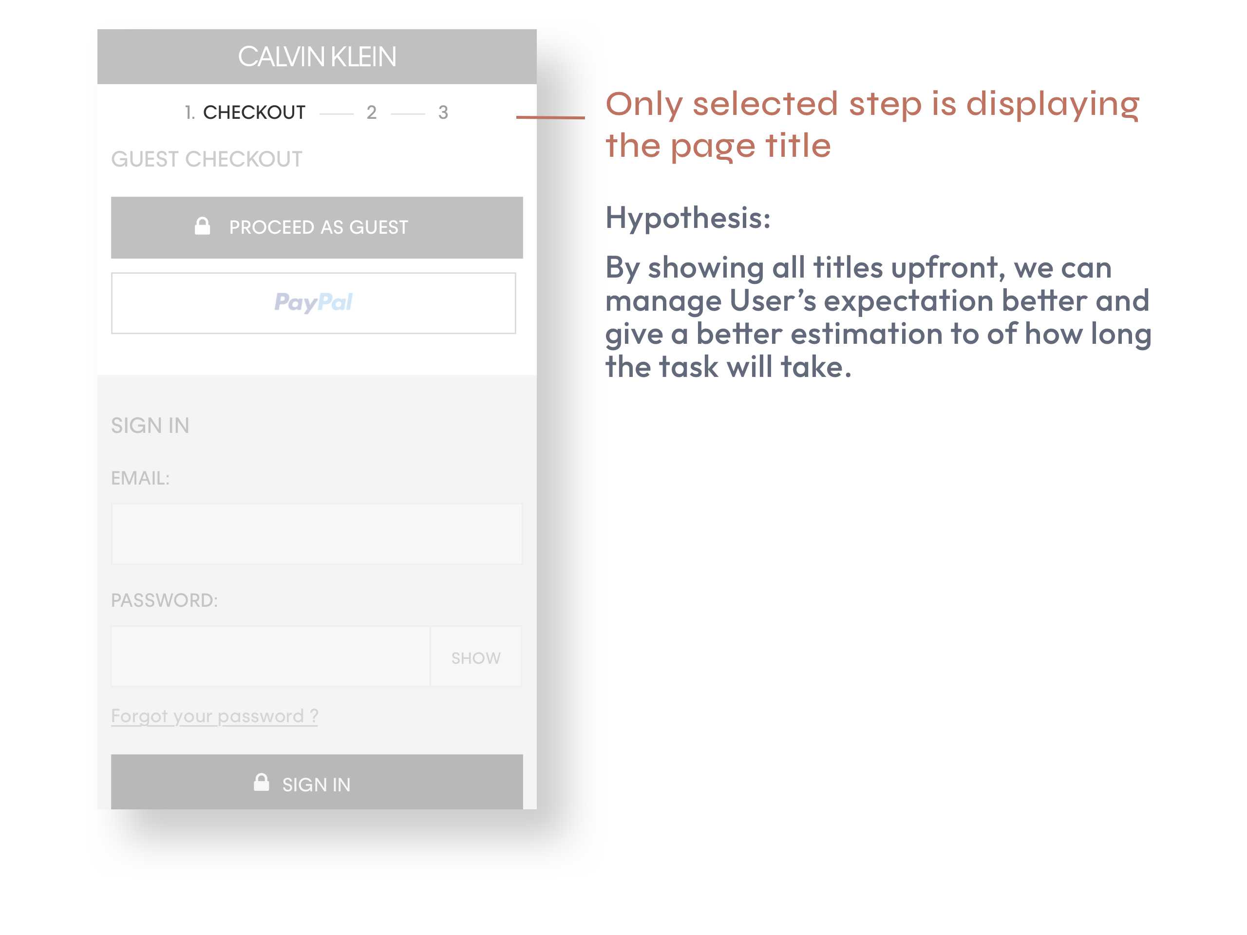
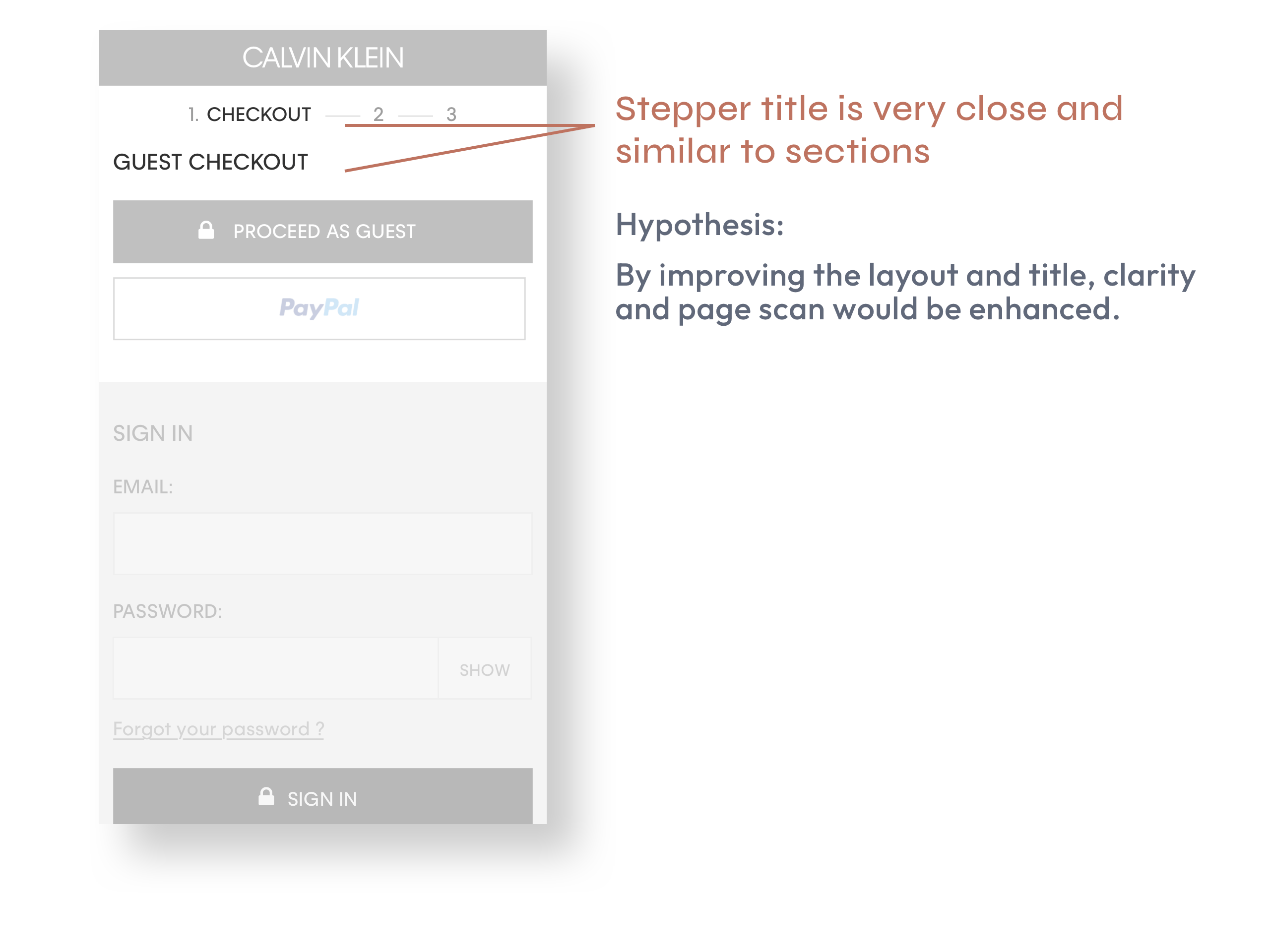
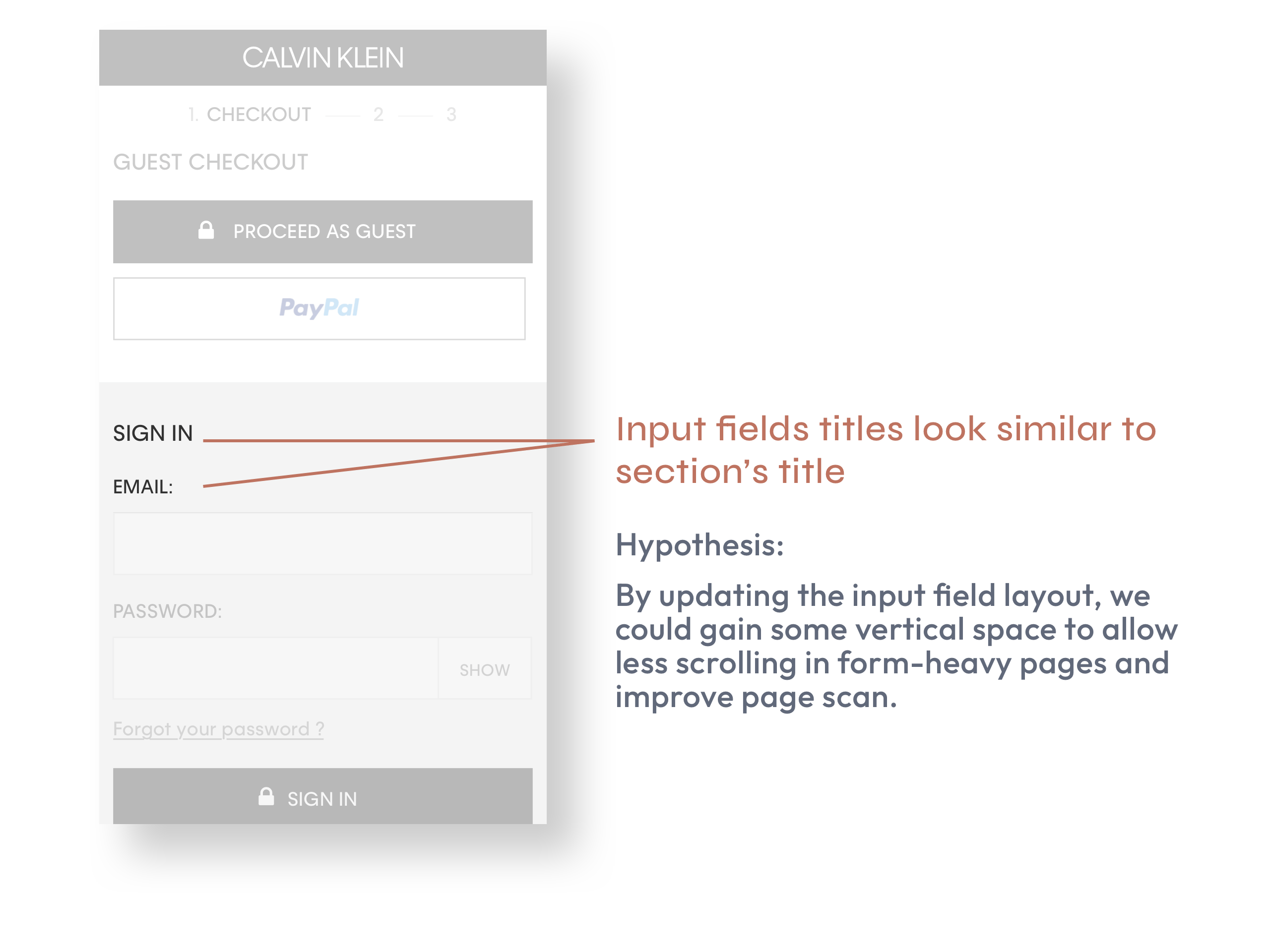
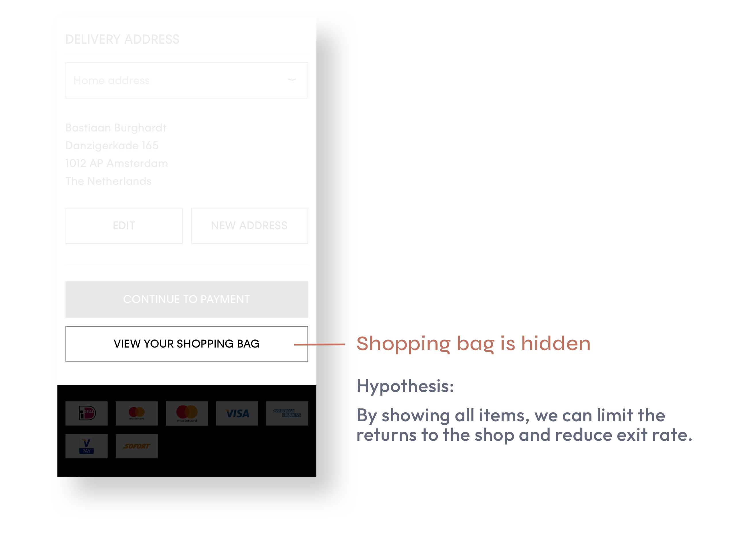
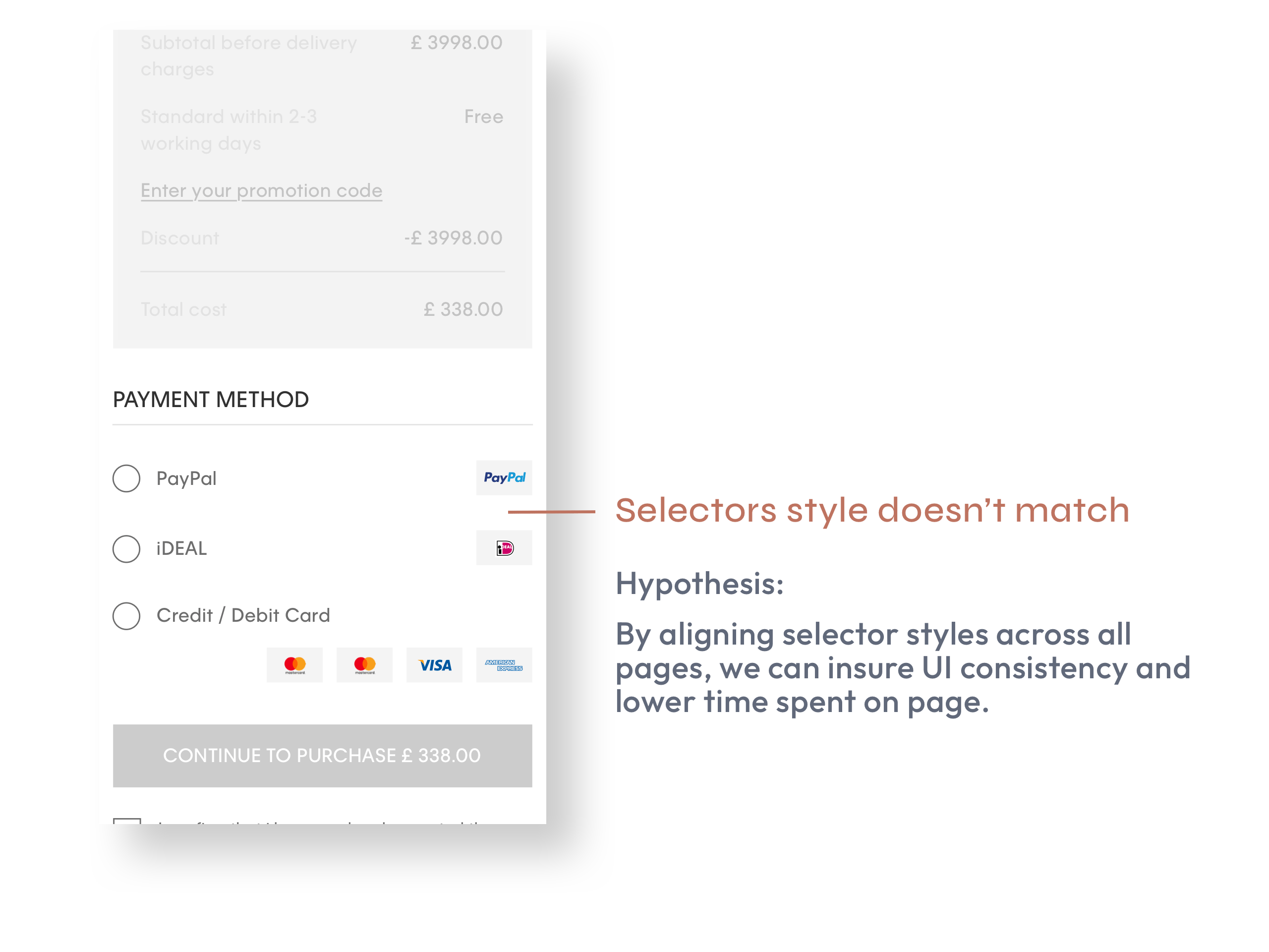
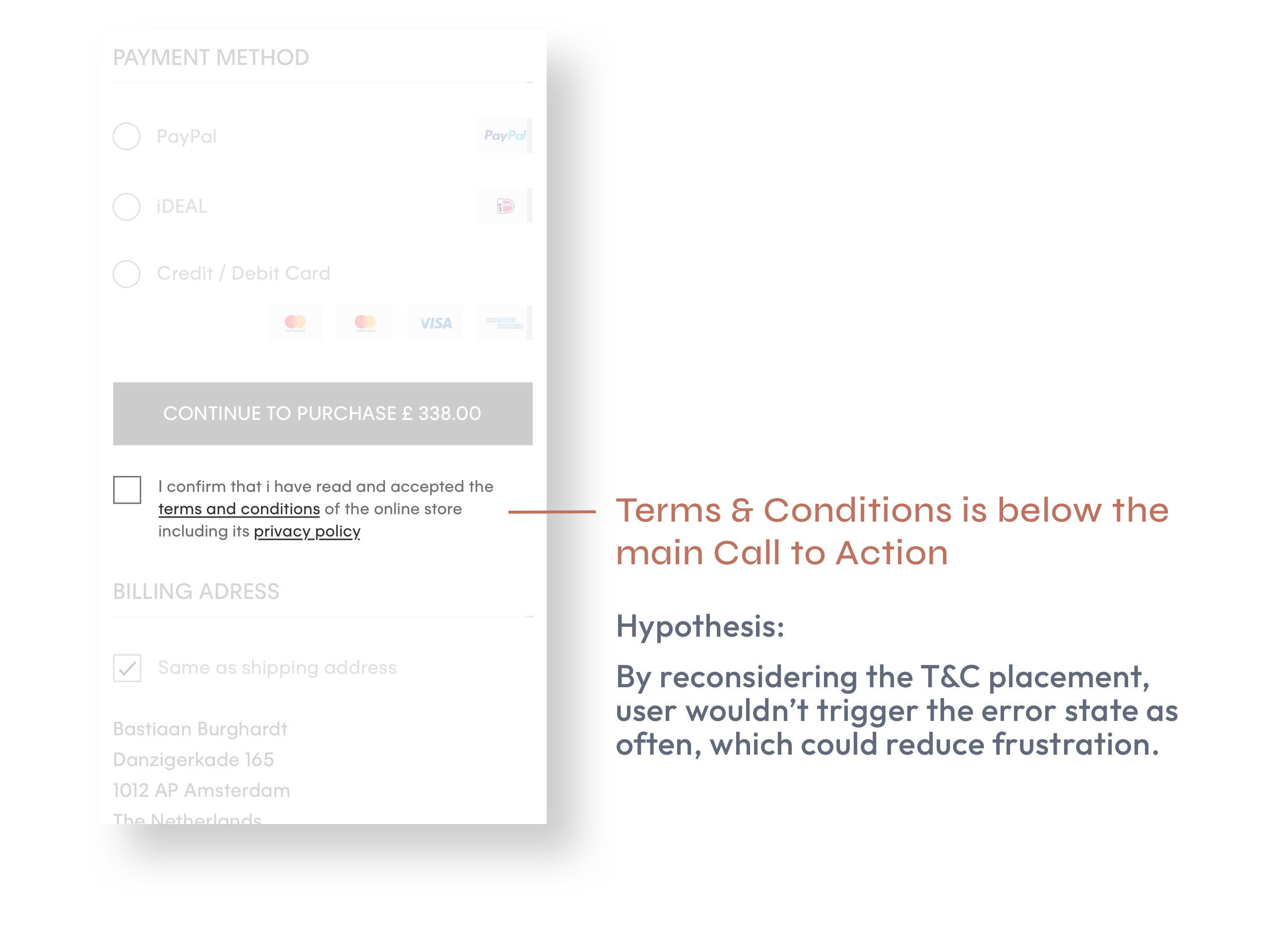
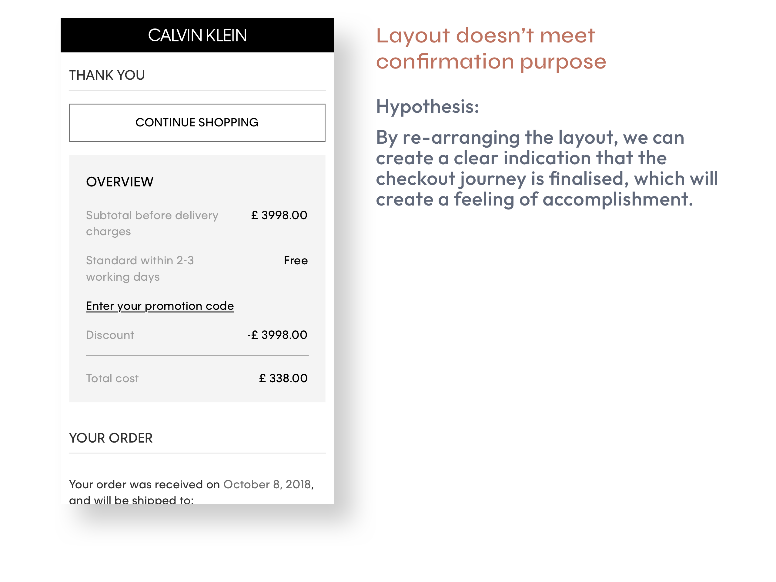
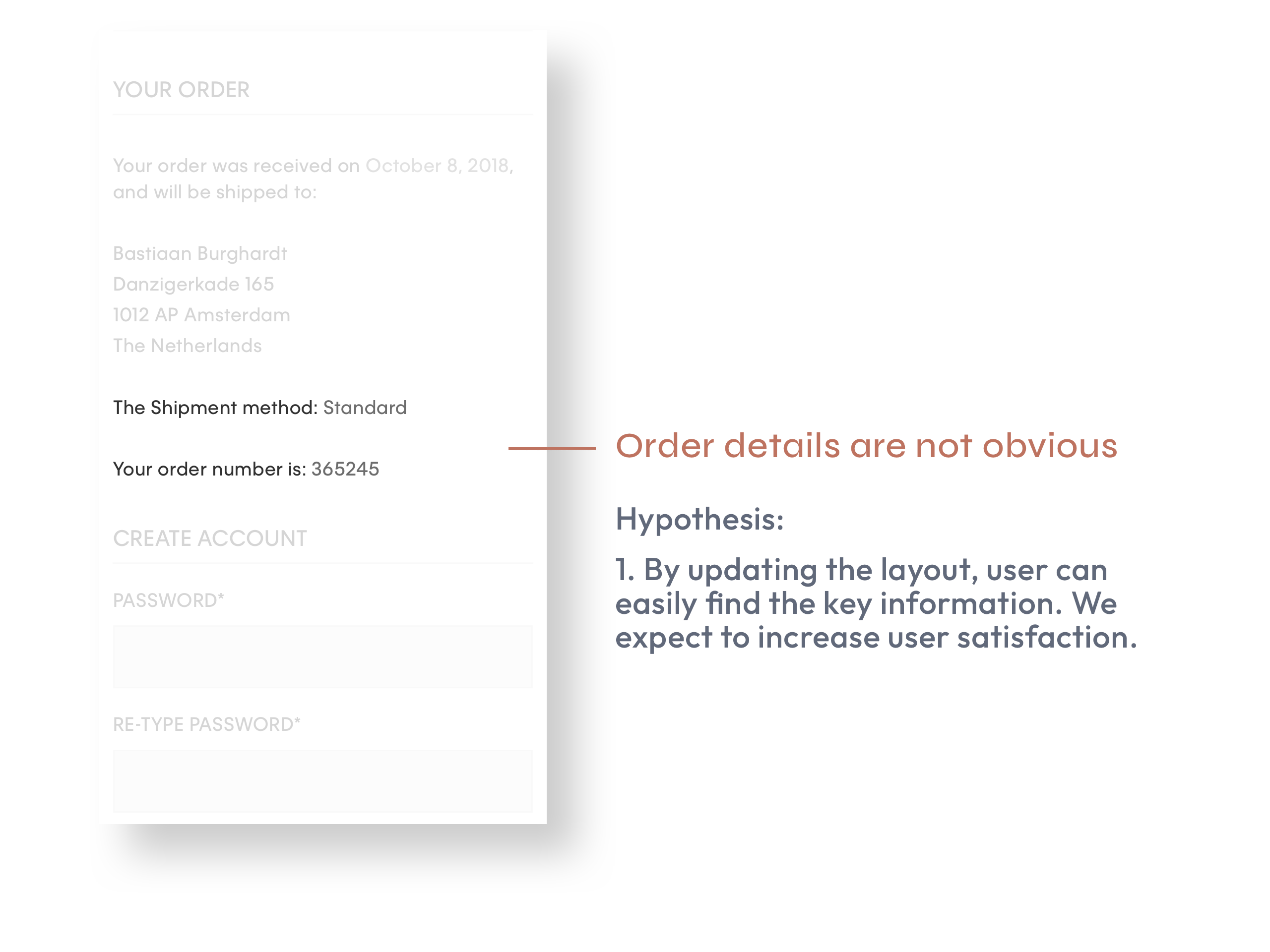
Live Site Review
Prior to starting designing the prototype, I carefully assessed the existing site at the time and identified areas that could be improved, forming relative hypothesis on how I could deliver and create value towards our user.
Pages
My favourite
Usability Testing
The aim of the usability testing was to identify issues and establish opinions on two prototypes for desktop and mobile.
Prototype 1: similar to live website checkout with small amends
Prototype 2: one page checkout
These two prototypes were evaluated with the objective of highlighting opportunities for improvement and was directed by the following three key research questions:
1.
How does the user perceive prototype 1 compared to prototype 2?
2.
Do users struggle to navigate the new prototype?
3.
Can users still progress through the checkout flow easily?
The main test objectives were:
- To test prototypes 1 and 2 on mobile and desktop under controlled conditions using participants representative of the CK demographic.
- To establishing a baseline of performance and satisfaction levels for the user interface to influence future iterations and checkout design
- To identify inconsistencies and usability concerns within the user interface and content. Potential issues could include:
Navigation errors
Failure to locate functions, excessive keystrokes to complete a function or failure to follow intended screen flow.
Presentation errors
Failure to locate and properly act upon desired information in screens or selection errors due to labelling ambiguities.
Control usage problems
To test prototypes 1 and 2 on mobile and desktop under controlled conditions using
participants representative of the CK demographic.
How it works
Methodology
12 participants were recruited to complete usability testing of the checkout journey. All participants completed the journey on both prototypes, 6 mobile and 6 desktop.
Introduction
Participants got to talk more about themselves, share positive and negative experience with online shopping.
Task
All participants were assigned the same task to perform on the live site while employing the thinking out loud method:
Task 1 – Find one product that you’d like to buy
Task 2 – Checkout without using PayPal
Questionnaire (SUS)
Once the task finished, they had to fill a questionnaire (System Usability Scale) to measure the usability.

Long Story Short
Prototype 1 performed better on mobile and prototype 2 performed better on desktop (happy to tell more about Desktop if you’re interested).
Here below are the actual prototypes participants interacted with. I entirely built them from scratch using Axure, which was the best tool to replicate a realistic shopping journey.
Prototype 1
Findings
-
Sign-in is clear, sign-up isn’t
All users understood the concept of sign-in, however for first time users who may have wanted to sign up, how to do so was not clear. -
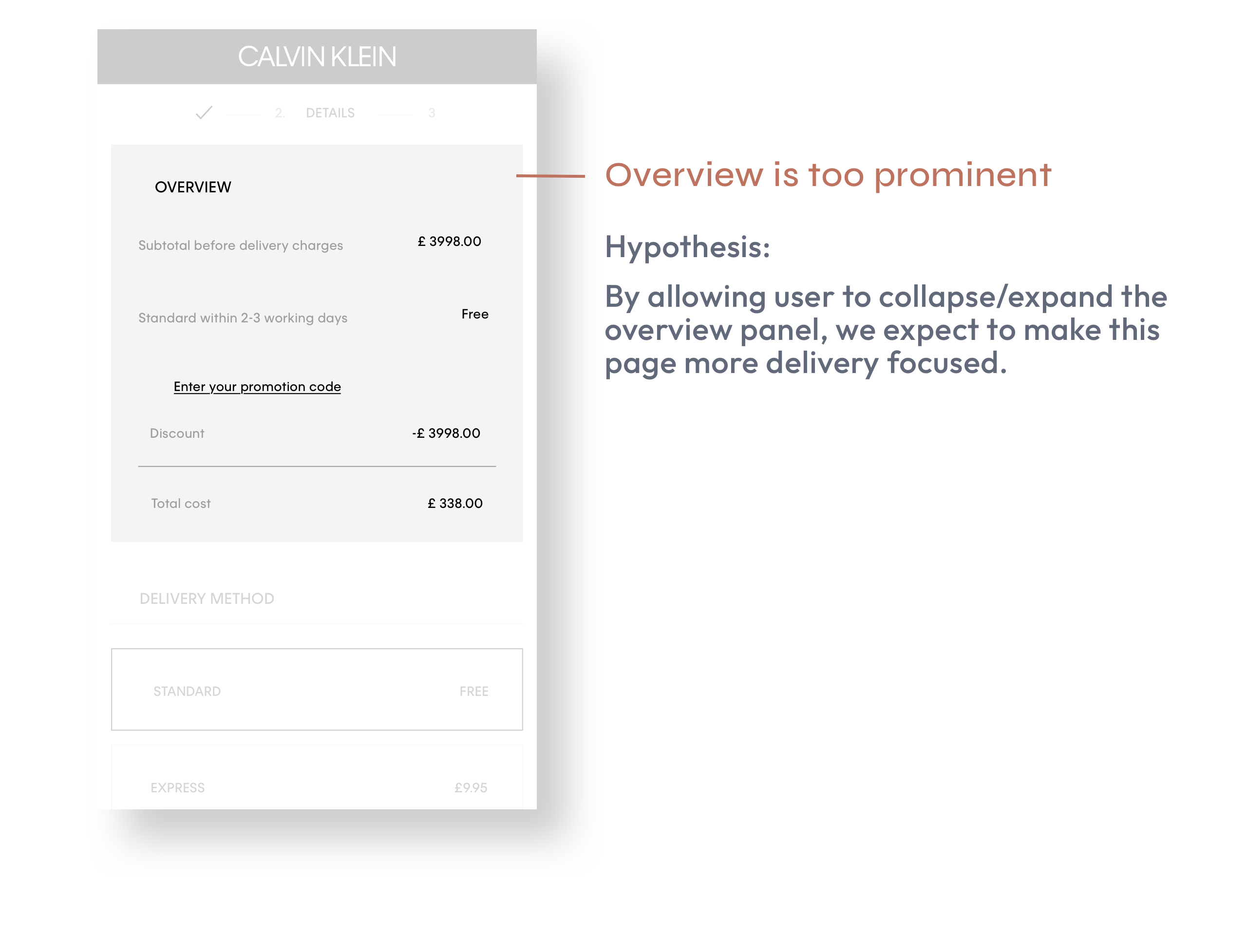
Overview uncertainty
The majority of users missed this section, and had presumed it would provide an order breakdown. This section did not meet the user’s expectations once directed to it.
-
Difficulty knowing which step has been complete
The stepper bar didn’t clearly inform users where they are in their checkout journey.
-
Order of checkout process feels awkward
Some users commented that to them, it would make more sense entering personal details before selecting the delivery method. -
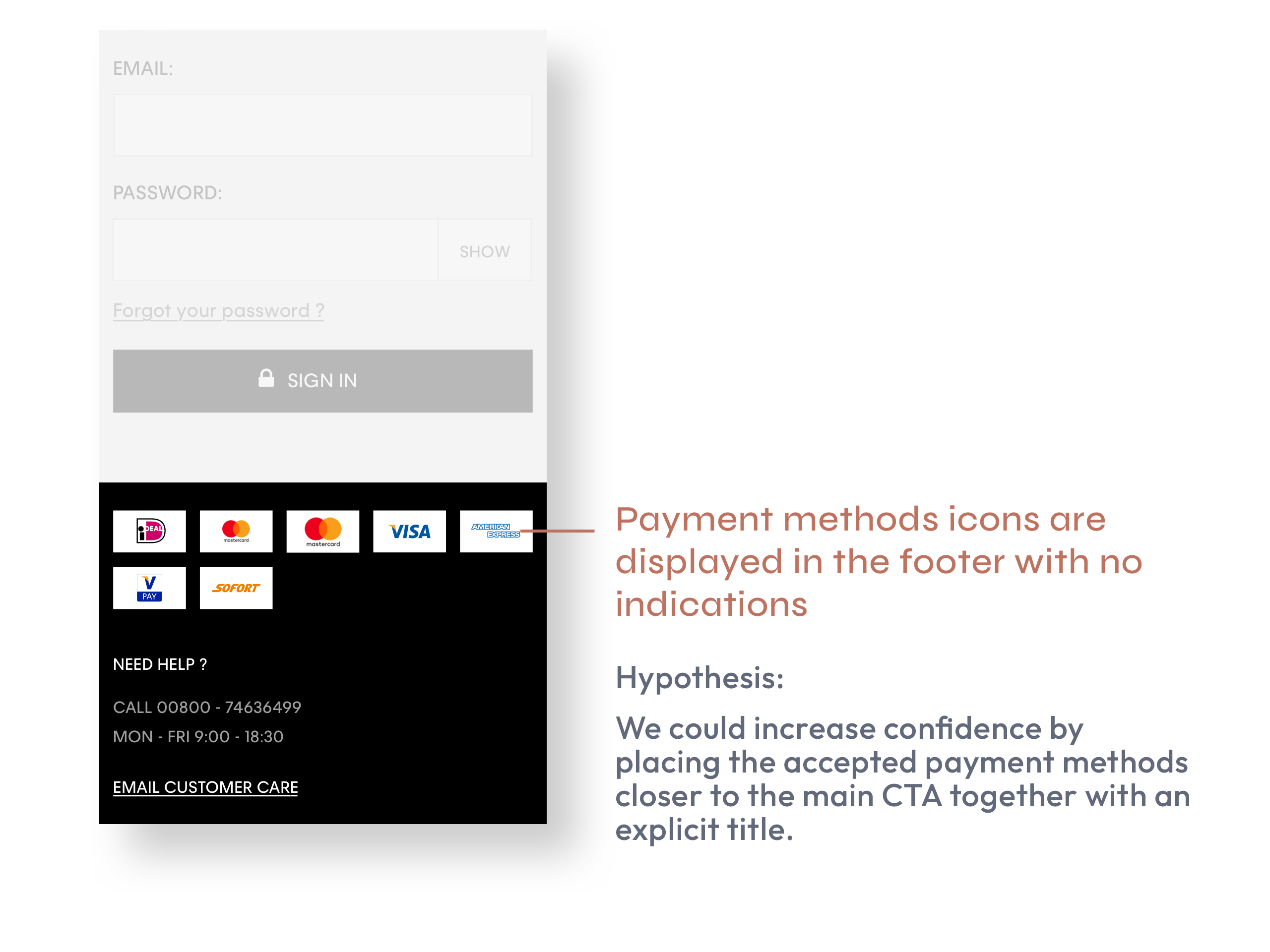
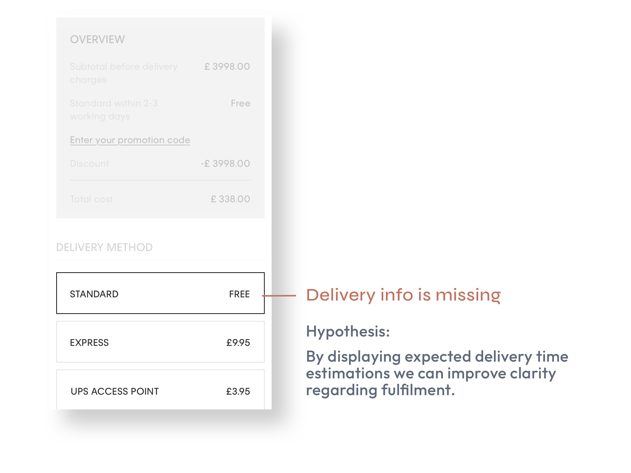
UPS pick-up point
The UPS pick-up point does not have an estimated time that collection would be available from, similar to the information the other delivery options provide. Users commented that they would expect to see this information when making their selection for delivery.
-
Redundant ‘TITLE’ field
Most of the users didn’t think the title field was needed on this page.
-
Offer additional payment options
Some participants have shopped with Apple Pay/Google Pay or know people that have shopped with these methods and prefer this to entering their credit card information. -
No date picker
Users appeared happy to input their card dates on the keyboard, and did not reference the missing date picker.
-
Unclear delivery detail information
All users referenced that on the confirmation page they had expected to see information regarding delivery date, tracking details or clarification that they would be shortly receiving an email containing this information. - Order of modules could be revised
One participant stated that the order of modules were better suited for the banner to be shown at the top and then followed by the delivery details, as the participant would be more inclined to sign up if it was shown first.
Prototype 2
Findings
-
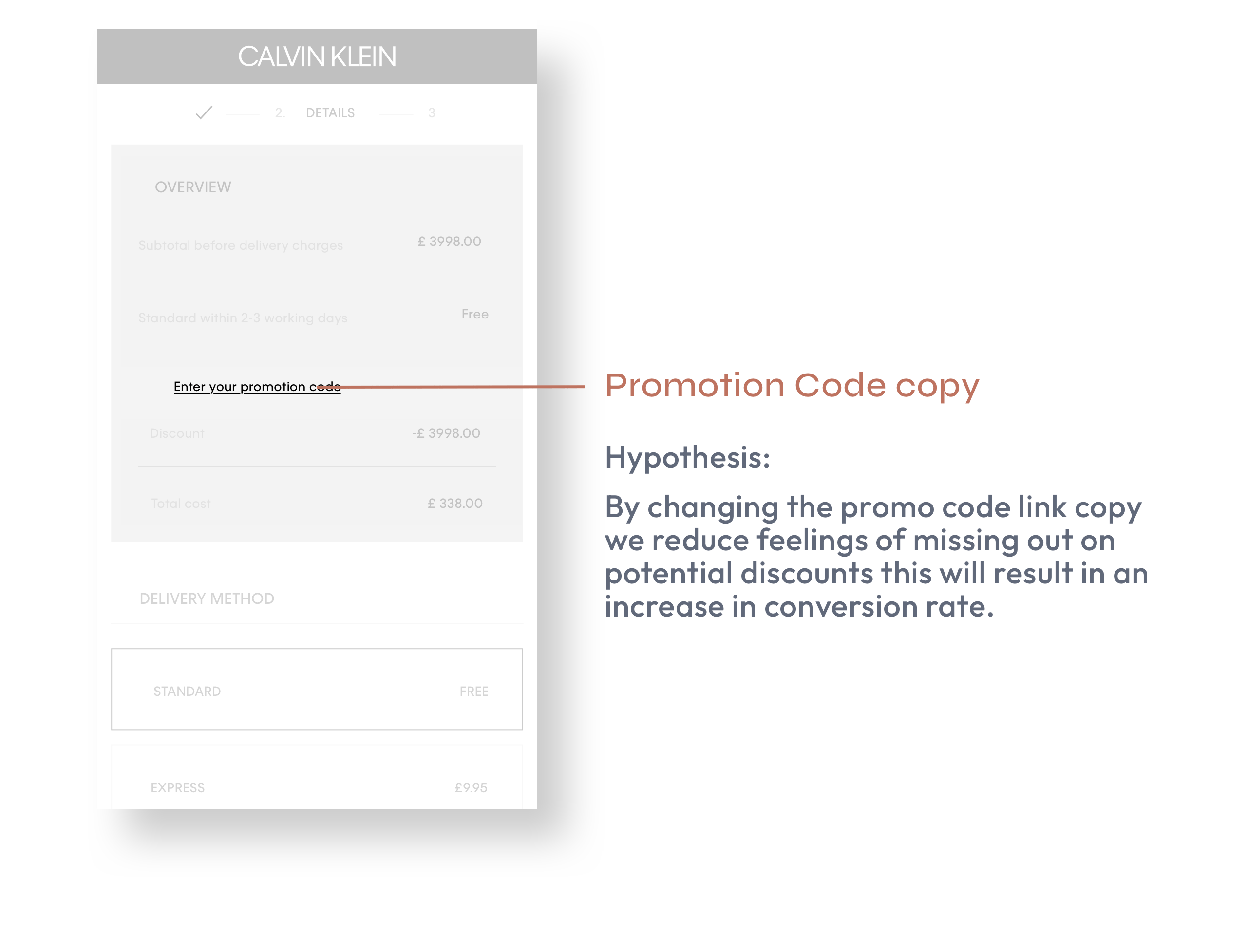
Lack of promo code functionality
Users explained they’d typically search on the internet for a promo code when they’re at this stage of checkout, so they were surprised to be unable to find a promo code field.
-
Unclear delivery time and options
Standard delivery was the preferred choice, however there was a lack of information about the time of day the delivery would arrive. -
Removing the ‘TITLE’ field caused no concern
Removing the ‘TITLE’ field appeared to make it easier to fill in the form, and its absence presented no problems.
-
Missing signposting / progress indicator
Some users were unsure how far through the checkout process they were and how much was left to complete.
-
Benefits of creating account are unclear
Users struggled to see any reason to create an account. -
Suboptimal page layout
Two participants suggested the “Create Account” section would be better placed above the delivery information.
-
Unclear delivery detail information
All users commented on missing delivery information such as the tracking details or prompt to check their email for their order confirmation.
Design Iteration
I oversaw the design lifecycle from prototypes to final implementation, working closely with developers to ensure design fidelity and incorporating feedback for continuous improvement.
We decided to go with Prototype 1, which besides being the usability winner was also easier to implement. The prototype was refined according to the user feedback and handed over to the development team.
Over the next couple of months, I performed a series of updates based on both qualitative and quantitative data. I also worked closely with the product owner to ensure all different states and edge cases were covered, aiming to facilitate the development further.
At the end, I produced 80 screens for each resolution; Mobile, Desktop & Tablet.

Outcome
A year later, when the refreshed journey was finally live we ran a new survey to measure customer’s satisfaction and here are the findings:

Using Adobe Analytics, we also learned the following:
+1.6%
Conversion Rate
-8%
Bounce Rate
+10%
Orders Share
Project Learnings
Find the right balance between Qualitative and Quantitative Data
A positive feature in user test could have opposite AB test results (noticed with the overview module and confirmation page). While listening to user preferences is key, only the most usability-friendly solution with a positive impact on OKR and CVR were the one I supported for implementation.
Involve developers sooner
At the time, there were no component library as the company was moving development environment. I realise this became a challenge to maintain consistency with developers, so I looked into ways to facilitate the designs'handover but also move out from the traditional ad’hoc approach. As a result, we agreed with the relevant stakeholders to adopt an atomic design approach, which was involving tokens and also applied additional agile workflows (such as 3 amigos).
Choose your battle
It was necessary for me to take into account the technical limitations in one hand, and the business scope in the other one, in order to make the right choice to decide what enhancements to go with. Some usability learnings were a great asset to keep aside when running follow-up AB test and see which solution would be worth implementing.
In July 2021, due to a brand unification with Tommy Hilfiger, we revisited and iterated the checkout experience with an Atomic Design based approach.
This was the occasion to update our design system and introduce design tokens and refine our existing process.
If you’re interested to know more about it, here is the case study!