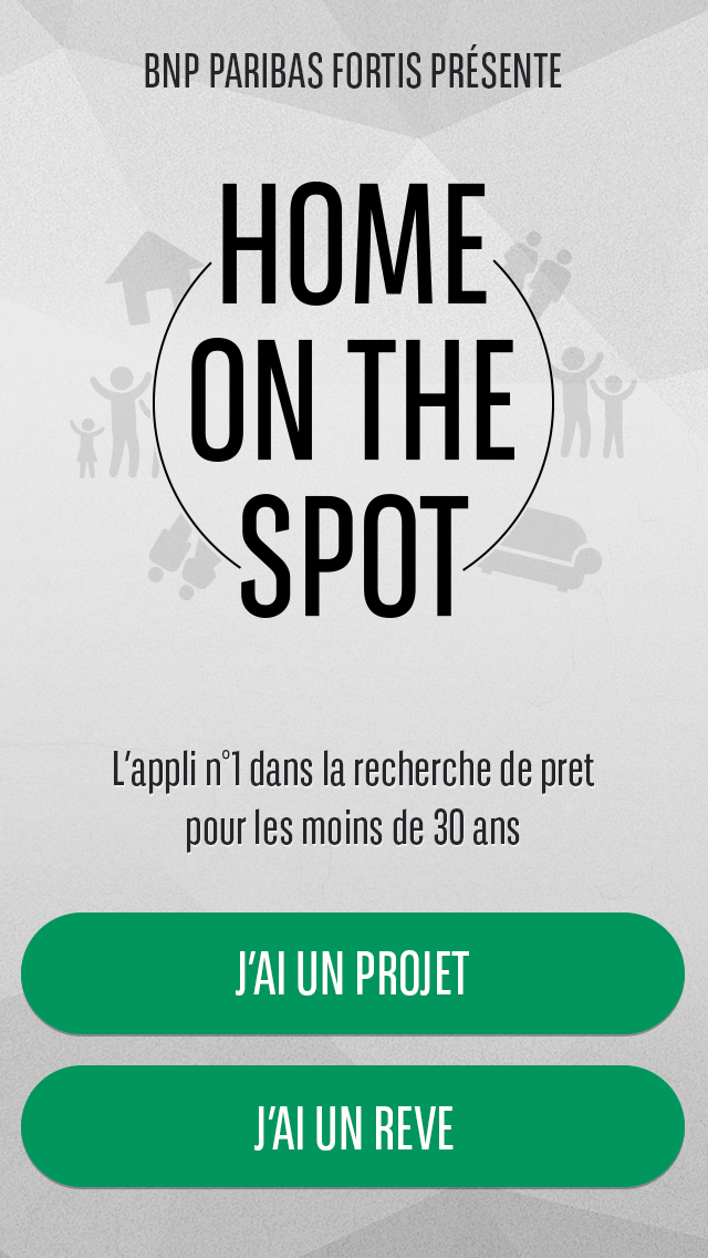
Two Birds One Loan
Client
BNP Paribas Fortis
Role
Senior UX/UI Designer
Year
2015
Location
Brussels, Belgium
From defining the project strategy to aligning it with business goals and user needs, I ensured a seamless and effective design approach.
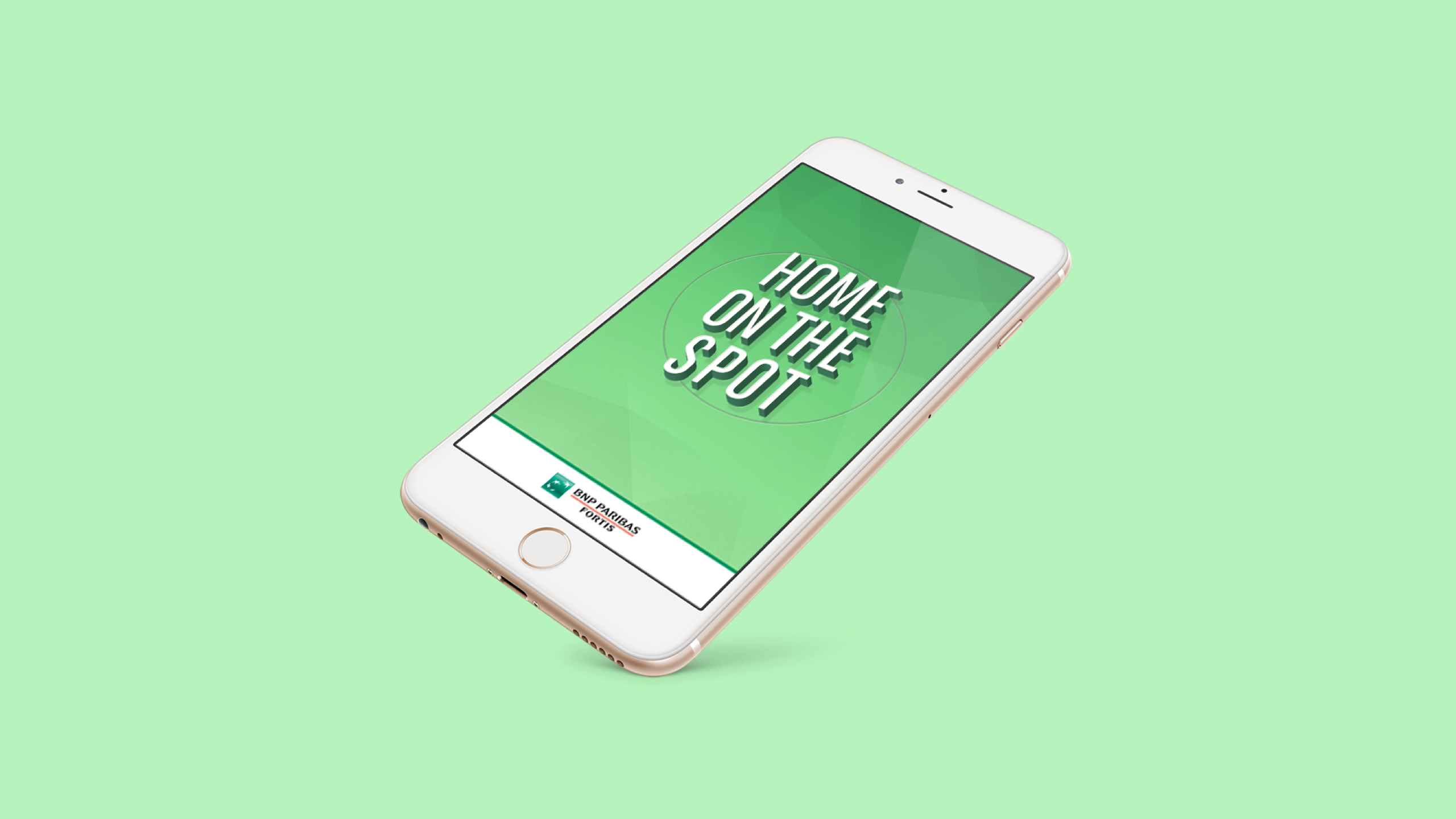
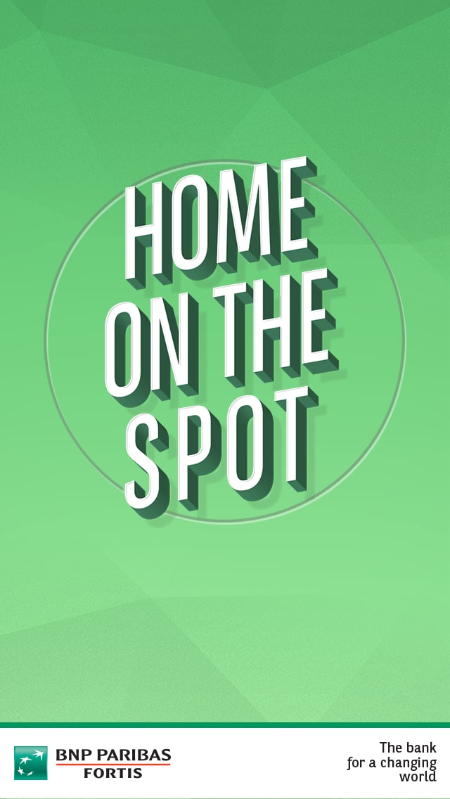
BNP Paribas Fortis ’s Home On The Spot was an ios/android standalone app that provided a mortgage calculator for young people.
This initiative was one of several key projects during my three-year tenure at BNP Paribas, where I was tasked with elevating user experience through high-resolution wireframes, a dual-brand design system, and team branding.
If you would like to know more about them, please get in touch.
Solution
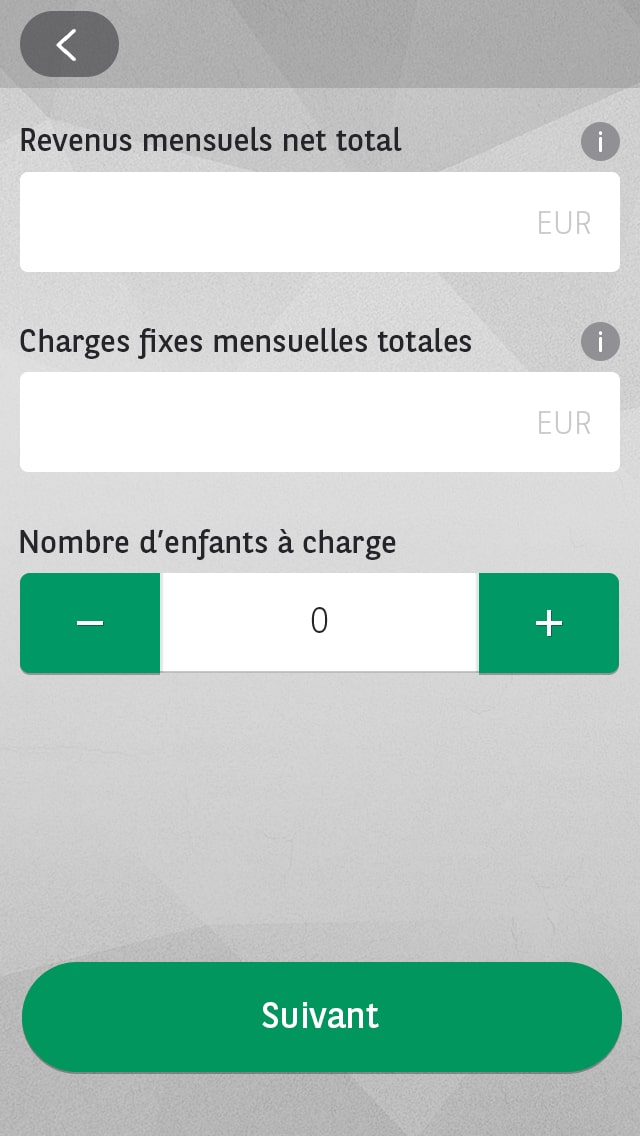
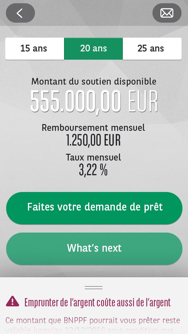
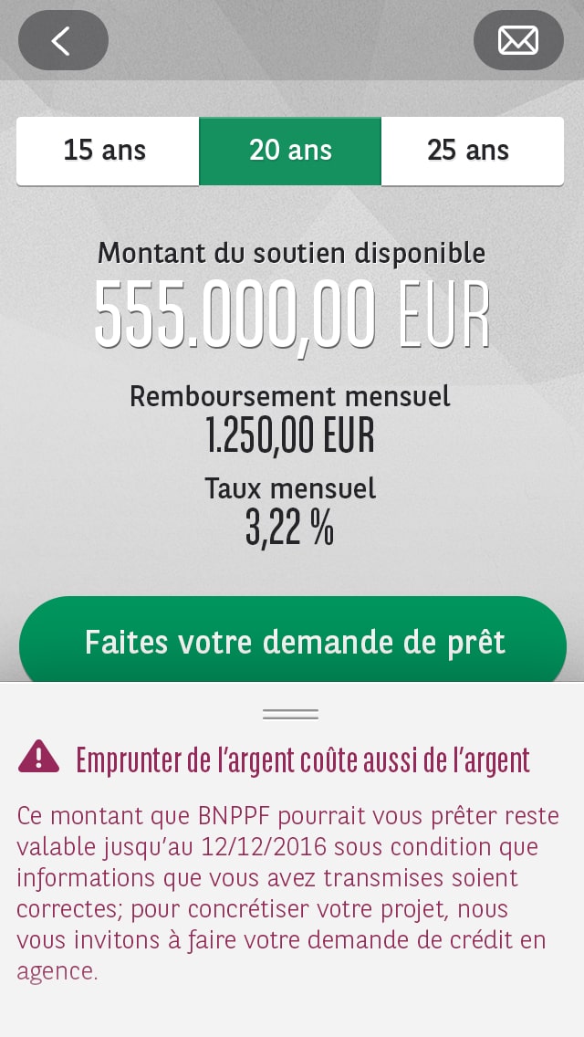
Provide a loan calculator in a real-time standalone app, so that young buyers can find key information on the spot.
I designed a real-time standalone app to provide instant loan calculations, enabling young buyers to access crucial information directly. My goal was to create a seamless and visually appealing journey that resonated with a younger audience. To achieve this, I incorporated feedback at every stage, ensuring the app was both intuitive and effective.
Process
I worked in an agile environment, which allowed me to follow the design thinking methodology:

Research

I translated key research insights into actionable design strategies, ensuring the app’s functionality directly addressed user pain points and business objectives.
Benchmarking
I initiated my process by studying competitor banking apps, noting that most lacked prominent loan calculators and were not mobile-friendly. This gap highlighted opportunities for our app to stand out:
- In most cases, loan calculators weren’t included in the main site navigation
- Loan estimations could only be done at a branch
- Few competitors offered a mobile friendly experience


User Interviews
I personally conducted 30-minute qualitative interviews with six millennial users to uncover bottlenecks and gather insights on user needs and preferences.
Research Goals
Any bottlenecks on the live website that prevent users from finding the information they need?
In what context would a user need to calculate a loan?
To better engage the audience, how could the brand or user interface be improved?
Is an app a better solution to get the information faster?
Learnings
- No one could figure how to reach the tool in the current live site.
- Creating a dedicated app is the favourite alternative, as this would be a more efficient single action.
- 90% said they would like to know how much they can loan while visiting a flat, so this could influence their purchase decision.
- As an interface improvement, bringing more icons and illustrations would be a nicer experience with a younger touch to it.
User stories and specifications
These insights helped refined the user stories which would later be included in the user flow.
While the user flow discussion would be in development, I started sketching out the different screens to prepare myself for the wireframe stage.

Branding
I developed the logo concept by sketching multiple designs that aligned with BNP’s brand guidelines but introduced a fresh, youthful twist. After collaborative feedback and usability testing, I finalized a logo that balanced modern aesthetics with brand recognition.

My first step was to sketch a variety of ideas, which would lead to the ideation of design solutions later on.
Key Requirements:
- Keep branded font
- Maintain brand Colour palette
- Include element(s) of house or home
- Logo should be noticeable and whole name should be readable
The sketches were discussed with others designers to seek for second opinions, then were presented to the relevant stakeholders for feedback.
As a result, 2 logos were equally fitting so to find a tiebreaker, the project owner agreed to including them in the first round of usability testing.
Option 1
Option 2
Prototype
Once the initial user journey was mapped, I translated it into a high fidelity prototype.
This initiative was necessary since we learned from participants the need to see icons, illustrations and different logos. Including these at an early stage would give us a better understanding if the chosen style was heading towards the right direction.
Prototype 1
Landing

Borrowing Capacity
Result
Legal Information
Prototype 2
Landing
Borrowing Capacity
Result
Legal Information
The first round of User Test was made through Invision, which was limiting the versatility of interactions but was sufficient to identify any usability issues.
The prototype was evaluated with the objective of highlighting opportunities for improvement and was directed by the following three key research questions:
1.
Do customers see value in the prototypes feature?
2.
Do users struggle to navigate through the app?
3.
Can users easily understand the legal characteristic of a loan?
Learnings
- For both versions, all participants considered the journey clear. The loan calculator purpose was understood by all, with some actively commenting how much they liked it.
- 4/6 participants preferred prototype 2 as they connected better with the look & feel, although prototype 1’s legibility was slightly better.
- It was also mentioned that prototype 2’s layout was more user-friendly and easier to scan
Design Iteration
The learnings from the prototype showed that my solution needed adjustment. While refining the look & feel of prototype 2 would help the user feel more connected to the brand, creating a clear call to action and refining the steps would have the most impact.
Visual Identity
I wanted the logo to be instantly associated to BNP with a younger twist.
To do so, I used the brand font and added some depth and isometric perspective to it (remember when this was the trend?).


Illustrations
I also worked on various illustrations, with the aim to include them along the whole journey.
Coming up with an improved version of prototype 2 that we took to another round of user testing:
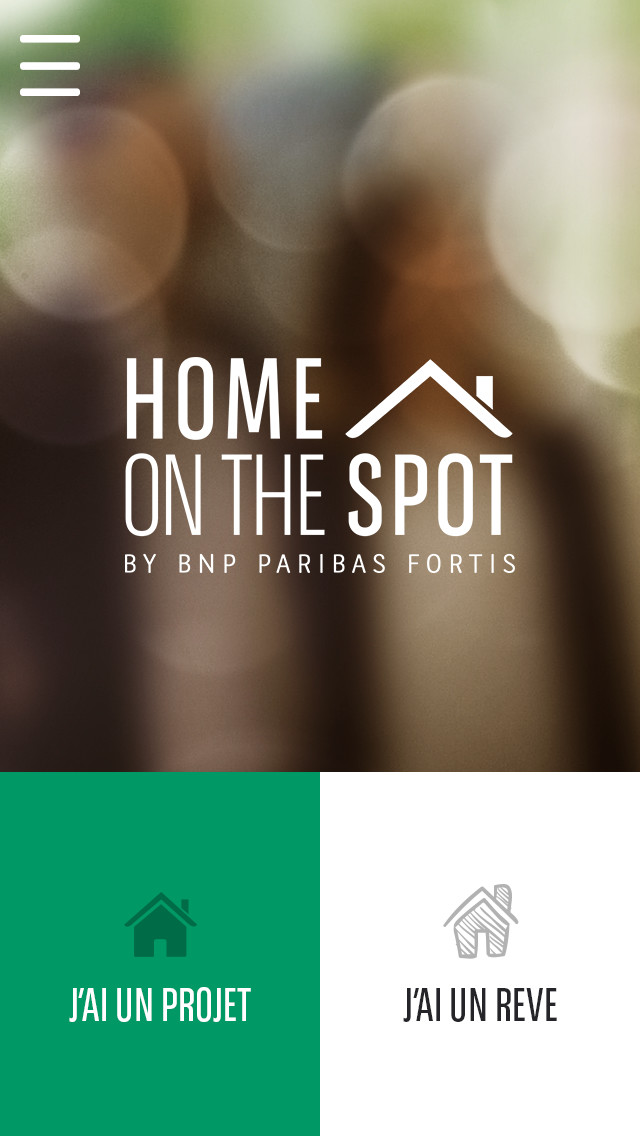
Splash Page

Dashboard
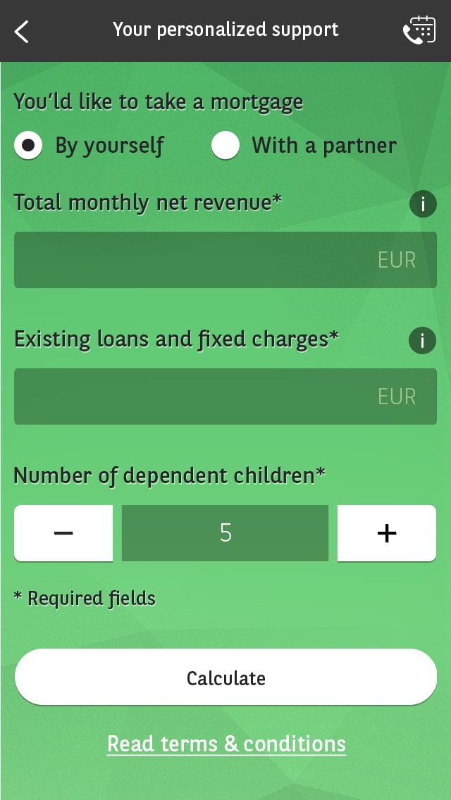
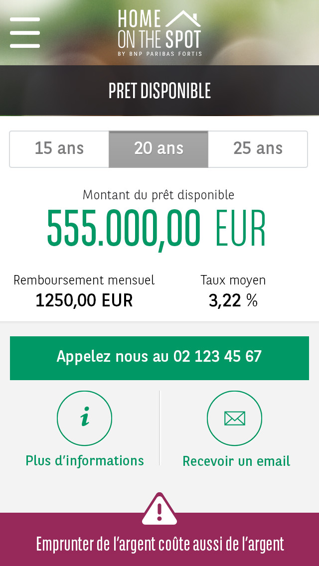
Borrowing Capacity
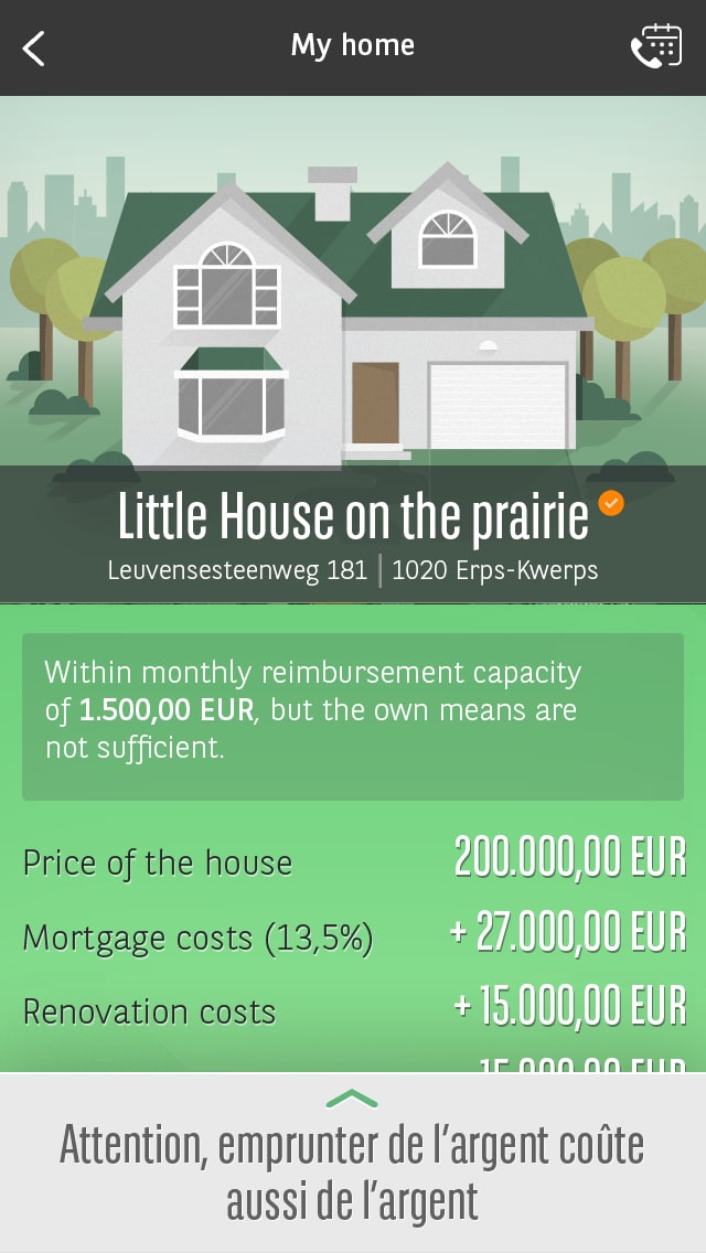
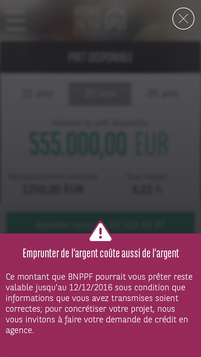
Result
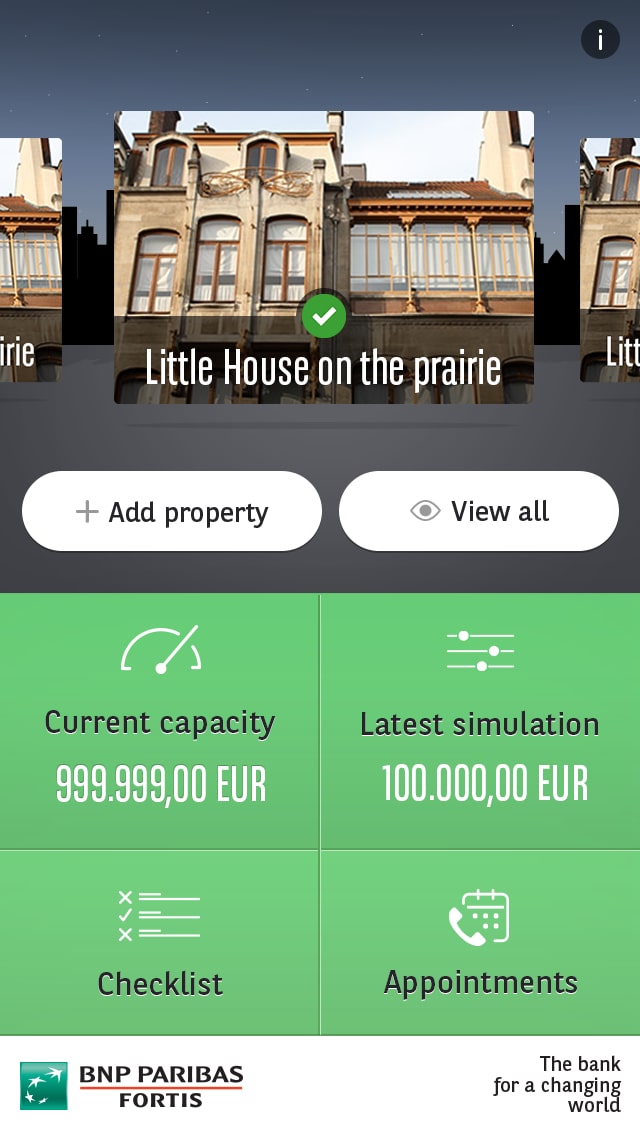
Dashboard + Data

Contact
Learnings
- No major issues were observed, however some participants tapped on the illustration first instead of the CTA. As a follow-up, we made the whole container tapeable.
- The lack of clarity about the contact icon in the header caused confusion for 4/6 users.
- All participants appreciated the whole look & feel and easily connected it to the brand.
Impact
The learnings from the last user test helped shape the final designs before the development handover. The app was successfully launched in December 2015.
As Home On The Spot would continue to be improved, the patterns and designs I created would be used to inform future parts of the product.
Post-launch, I monitored the app’s performance and user feedback, iterating on the design to enhance its effectiveness and maintain alignment with user needs.
Here are some figures measured within the following 6 months after release:
5K
Downloads
30%
Retention
+12%
Loan Requests
Project Learnings
The Importance of WHY
After presenting design solutions to a team of developers, I’ve faced multiple pushbacks. I learned how to listen to and acknowledge their feedback, but also stand by my decisions by explaining my rationale and why I’ve made the decisions I’ve made.
Adaptation
Another big lesson for me was how important it was to understand the diversity of user’s habits and adapt to it. The key to success was to embrace the brand’s characteristics and peculiarities.
Flexibility
The scope of the project changed constantly due to tight timelines and reprioritization. I had to adapt to those changes and still deliver the best design in time with short deadlines
I really enjoyed working on this project, as my take in the user experience was to make it as intuitive as possible. I myself was thinking of buying a home at that time, so I used my relation to the process as inspiration for the product; designing and experimenting with different paths that I felt would be helpful to me as a user.
Working with a small team in a full agile environment helped to iterate on the product at a faster pace, and benefiting from frequent usability sessions facilitated the connection with end users.